


There are some designs out in the world that are so confusing, you can hardly believe that people actually came up with them. Like, they’re just so bad, it doesn’t make any sense.
And yet, here they are, in all their glory . Or at least, here are the ones in this list. They’ll probably make you think you could do better.
Winter sucks? Winter socks!

You can tell that whoever decided to put a hat on top of the O (which also acts as the I in winter) didn’t really think it through. At a glance, it looks like they’re saying that winter sucks, while simultaneously celebrating the season. How confusing.
Happy New Year! Welcome 20022!

I feel like we, as a society, peaked in the year 2009. That was the last year that you could have the two zeros as eyeholes, with the other numbers of the year on each side of a set of New Years glasses.
2010 worked too (mostly). Even 2020. But we’ll never recapture the magic of the 00s.
“Even in perfect conditions it would take way too long to figure out what this web address is.”

Having a nice font for your business can make or break your advertising prowess. This font… let’s just say, you’d probably end up rear-ending the van if you tried to read it while driving.
“What in the world does this sign from my friends wedding mean?”

This is a bad design double whammy. For starters, the schedule/flow chart thing is really hard to read or understand. But also… what word is that supposed to be after holy? Because it sure ain’t matrimony.
RELATED STORIES


An attempt was made, I’ll give them that.

I know it’s supposed to say “grand,” but it doesn’t flow right. I almost feel like it would’ve been better if they put the A where the sleigh is, and just stuck a star on top or something.
“I’m going now for work just because once again crazy.”

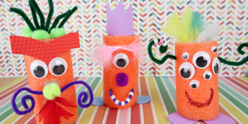
Everything about this is so weird. I do think that those are all supposed to be options that follow the words, “I’m going,” but, like, why? What purpose does this serve on top of a shelf full of Mountain Dew?
Happy holi- hey, wait a minute!

Why… why would they wrap the word around the picture like that? Why not just make the font smaller, or place it differently.
To be honest, though, this looks like it was probably made by some unpaid intern who simply didn’t care.
“The holes are too small for the glitter.”

This design isn’t just bad, it’s frustrating. What’s the point of having holes on the top, if they’re too small to actually use? Something like this is why arts and crafts are a lot more stressful than they seem.
“It’s supposed to race RACE WEEK.”

This is wrong on so many levels. Literally! I would’ve thought it said “RWCE AEEK,” or “RAWECEEK” before I ever got to “RACE WEEK.” Like, who decided this was an okay design to go with?
“The sticker on my contact to tell me which eye it’s for.”

I’m so confused… whose right is that contact for? Because it says right, but the R is on the left side, Does that mean you hold it upside down so that it lines up with your right side? Or did they really mean your other right?
Why… why is the font like that?

I feel like this is either some kind of whacky misprint, or someone out there really thought they were doing something with this. In any case, it’s just horrid, and looking at it is making my eyes hurt.
To be fair, though, all bootleg hats and accessories are bad.

It’s like the people who make these slap whatever children’s cartoons they can think of on one hat. Is Dora the Explorer a Pokémon? Not even close. But hey, I’m sure there’s a market for people who actually like these kinds of things.
“When you find out the hard way that the Italian restaurant’s hand sanitizer looks EXACTLY like olive oil.”

Look, fancy hand sanitizer bottles are fine and all. But maybe don’t use sanitizer in an Italian restaurant that looks like olive oil… I don’t think I need to explain why that’s such a poor design idea.
It’s like, what’s even the point?

At this rate, you might as well not even have stall doors. Because there’s no point if they’re made of clear glass. I wish bathroom designers would remember that there’s nothing wrong with a solid stall door.
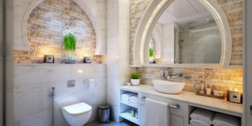
Need toilet paper? Well, too bad!

Imagine having a bathroom like this one. Every time you reach for the toilet paper, you remember that it’s practically on the other side of the bathroom. I feel like this room doesn’t get used a whole lot.
Taking the term “water closet” to a whole new level.

So a water closet is a little room in a bathroom that just has the toilet, right? Well, this is a closet with a urinal and sink in it. Totally different things.
“Received my ‘flannel’ pajamas In the mail the other day. Had to return them for fear that wearing them over the holiday weekend would give my 80-year-old FIL a heart attack!”

This looks like the kind of shirt you’d wear with something underneath. Like, during the day. It doesn’t look like a flannel pajama top, that’s for sure. Talk about false advertising.
“Mug with heating tray from China, keeps liquid just above room temperature, don’t bother microwaving it though…metal letters and lining!”

I always thought mug heaters were supposed to keep mugs hot, not kind of warm… And the fact that the mug itself isn’t even microwave safe. What a mess, to be honest.
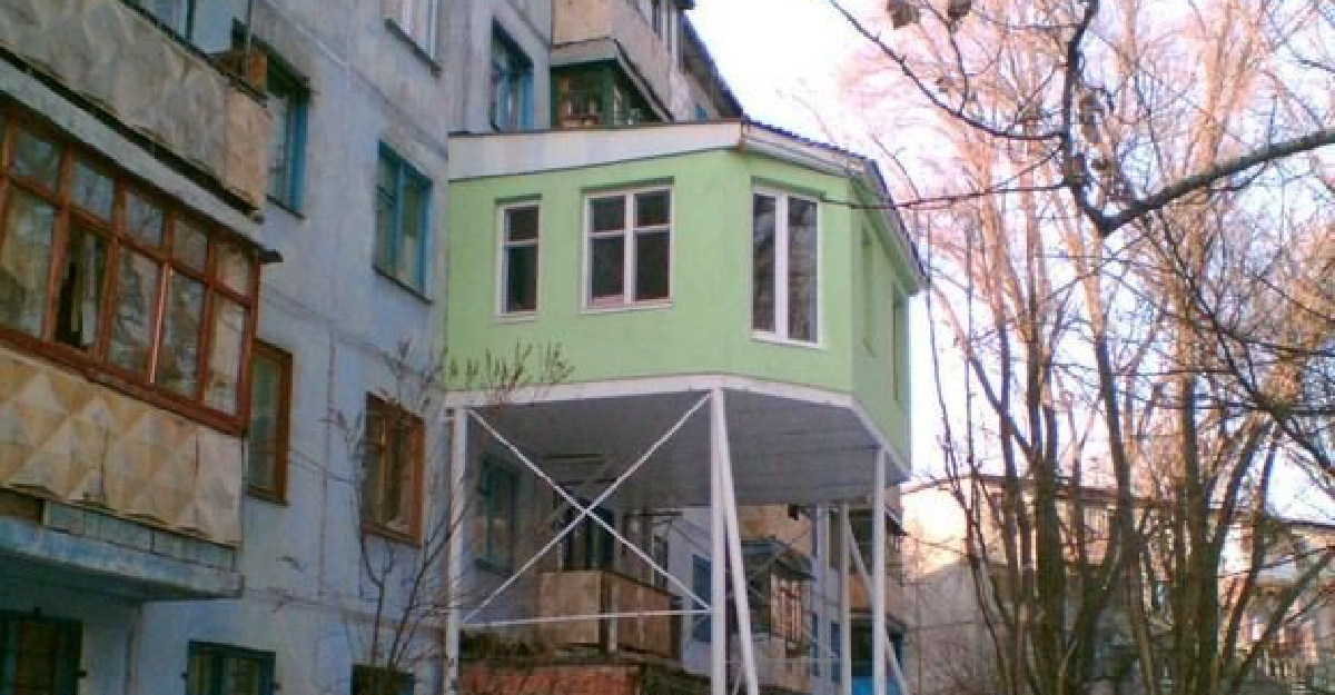
“Russian balcony modification.”

Not only is this woefully out of place with the rest of the exteriors, but it also seems super unsafe. I feel like it’s a huge code violation, too, but hey, what do I know?
“Website of the Yale School of Art.”

I can’t tell if this is ugly on purpose, or if they genuinely thought it looked good. Either way, it looks like such a difficult website to try and navigate, since everything seems kind of jumbled together.

