


Man, there are some really bad designs out there. And there’s nothing we can do about them but sit and stare, and maybe ask a question or two.
And, well, these designs are pretty bad. You may have questions , but just know that you’ll never get a real answer. There are some things in this world that we just can’t help.
“This door will never be opened. Found in an Austrian spa.”

Don’t you just love confusing designs like this? Why would anyone put that door there if there was going to be a railing there too? Or maybe the railing came first and the door came second? I wouldn’t be surprised, honestly.
“These weird paintings of fruit and vegetables in my school’s cafeteria.”

I don’t like any of this. I’m sure it was an attempt at being kid friendly (since it’s in a school), but I can confidently say that this is probably going to make a bunch of kids scared of vegetables.
The way this person is sitting at their computer.

Do… do they know that the monitor is behind them? Like, I don’t really get what’s supposed to be happening here. This icon just doesn’t make any sense, and it’s really bothering me. Just let the poor dude use their computer properly!
There’s writing on the side of this can.

Believe it or not, that label has words on it. We’ll never know what those words say, though, because the letters blend in with the background (it also may not even be in English, but that’s kind of besides the point).
RELATED STORIES


“It’s Time To Back School.”

See, I don’t even know what this badge is trying to say. “It’s time to go back to school,” maybe? If that’s the case, it’s fully missing a word, so it just looks like gibberish no matter which way you order the words.
“This switch cannot be turned on while something is plugged in.”

I have a feeling no one thought this through. Hopefully it isn’t too late to just switch the plates out for something a bit better, though I’m not really sure that would help all that much. Maybe just use a different outlet.
There’s a lot about this that’s just wrong.

This costume is scary, and not in the typical Halloween way. It’s an “Amon Us” costume that doesn’t actually look like it could fit a human. In fact, the picture of the dude is so badly photoshopped, it makes this costume seem a lot smaller than it probably is.
“My wife got a new measuring cup with a set of mixing bowls she bought. Not only do the measurements make no sense, they’re also just plain wrong.”

Last I checked, 1 cup is 8 ounces, and 3/4 of a cup is bigger than a half cup. Nice try, though.
The perfect spot for a shower.

To be honest, the shower itself isn’t really a problem. If this is a science building, it could be there to wash off chemicals and stuff.
No, the problem is that there’s no drain. Do they just expect people to flood the hall? Or is it there for show?
“They tried to make it look like an eye test.”

It took me way too long to read this sign (especially the top part). And my philosophy with signs is that they aren’t good if they take too long to read. They just don’t work, and will have people staring in confusion.
“Saw this bag while working and had to take a pic.”

I don’t know if it’s just me, or if this is a really poorly placed set of words. Like, I definitely couldn’t see myself buying something like this, like, ever. I’d just confuse myself, and probably everyone around me while I’m at it.
So many urinals and yet no room at all.

So, is anyone expected to actually use this restroom? Because the urinals are so close together, with such little legroom, that it would actually be impossible for more than one person to be there at one time. So, no. This sucks.
“Pb Pa Res.”

It took me approximately six tries to realize this is supposed to say, “pub, bar, patio, restaurant.” But this sign is such a mess. Text going in different directions, some of it in different sizes. At least the font and color are all the same, though.
When you want the look of dirt without any of the actual dirt.

Remember that pair of shorts that looked dirty? This is, like, its jacket cousin that’s even worse. This one intentionally looks like it has mud on it. Why anyone would willingly walk around with a simulated muddy jacket, I just don’t know.
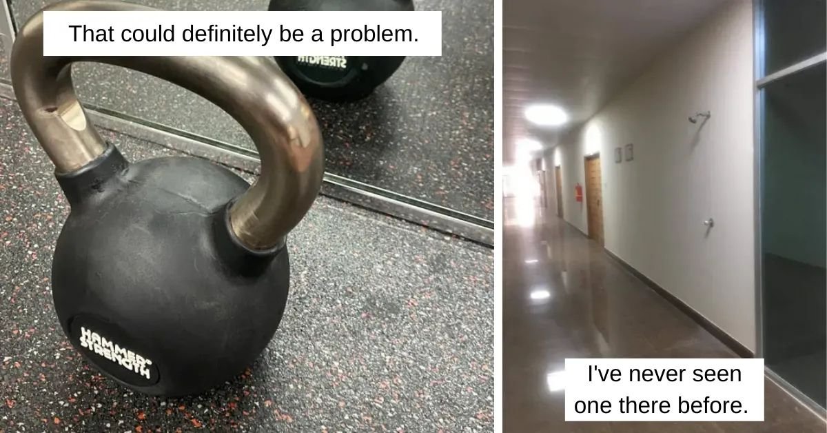
“Kettlebell without weight label. Is it 35lbs? 25lbs?”

This seems unsafe. Not knowing how heavy a weight is means you won’t know how much effort to put into lifting it. It could be way heavier than you thought, and you pull your back or something. Or it could be way lighter and you accidentally swing it into someone.
“This nurse themed sticker pack with a temp of 98.6 C(209 F).”

I’m sure this was supposed to read Fahrenheit and not Celsius. Because, as we should all know, those are vastly different units of temperature. Like, if your body temperature is 98.6 degrees Celsius, you’re probably dead. 98.6 Fahrenheit is normal.
“Are these flamingo eggs? Why use flamingos if they’re chicken eggs?”

This is the absolute strangest way to advertise eggs. Like, were the chickens from the farm unavailable? Were they free ranging too much and the company couldn’t find a good picture of them? Did they really think that using flamingoes was the way to go? Because it isn’t.
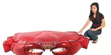
“This trash can makes me uneasy.”

It’s the teeth. Trashcans shouldn’t have teeth on them. Like, unless it’s specifically horror or Halloween themed, there’s no reason for teeth to be anywhere near something you might put your hands on.
I don’t know if they meant for this trashcan to look so sinister, but it does.
“These shorts that look like they’re stained.”

I guess this pair of shorts is trying to go for a tie-dye look. But not like this. This looks like dirt, and no one should wear a piece of clothing that looks dirty without actually being dirty. It just doesn’t make any sense.
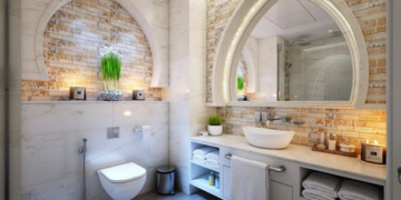
The placement of this toilet.

I guess this bathroom was built within a tight space? Still, I feel like they could’ve done a better job with the toilet placement. It seems so strange to have it floating in the middle of the room like that.
And the window behind it. Weird.

