







































Not all designs can be winners. For every clever logo that works perfectly, or every element of ingenious design, there are about a hundred examples of designs that did their best and still fell flat on their face.
Looking through this list will give you that much more appreciation for the designs that actually work well.
“Professor, I can’t get these audio files in our textbook to play.”

As our world becomes more digital, we’ll probably see stuff like this more and more in actual physical books. Maybe if you use a pinching motion to zoom out, that audio file will play.
“This Habitat for Humanity van.”

I’ve always had a good impression of Habitat for Humanity, but this van makes it look like there might be something more sinister going on, even if it’s dressed up in cheerful rainbow letters.
“This clock store in Benghazi, Libya.”

This store really played itself with this design. Yes, you can fit an L into an O to make it look like a clock. But if you do so, it’s going to make it look like the sign says something else.
“Teaching kids terrible things at Wellington Zoo.”

I think I finally get it: we need to preserve endangered animal populations, not because of biodiversity, but because these animals are needed to break down our various waste products. Everyone knows that monkeys love eating landfill.
“When life gives you lemons…”

If this sign had said “Lemons: perfect for lemon juice,” it would seem a little bit on the nose, but at least it would be accurate. I don’t know what’s up with this sign. Maybe they just wanted to make you think.
“Getting mixed signals here.”
![Image credit: [deleted]](https://static.diply.com/cGqaBB9mvrNKA8iuNSbU.jpg)
There are no mixed signals here at all. You’re not allowed to smoke, but here’s an ashtray. You can use it for ash if you’d like. Just, like, not the kind of ash that smoking produces.
“Warning: made in China.”

Some people seem to think that something being made in China means it’s junk. Sometimes this is true, but we also forget that most of our stuff is made in China. This warning just doesn’t seem fair.
“This company really values their customer’s opinions.”

This is either a completely tone-deaf way to accept customer suggestions, or it’s the greatest example of passive-aggressive messaging I’ve ever seen. Like, go ahead and submit a suggestion…right into the trash.
“Pulling tissues from this box feels… uncomfortable.”

Y’know, I love Spidey as much as the next guy. I don’t want to invade his personal space. But sometimes, you need a Kleenex, and you can’t let awkwardness get in the way. Sorry, Spidey.
“Probably it’s more convenient…”

Give the guy on the left a close look. He must be an alien, because no human being would ever eat an ice cream bar in that way. The wooden stick thing is there for a reason.
“My son’s educational alphabet puzzle.”

Did they mean to put a jaguar here or something? This is another one that seems like it would be an easy error to avoid. Seeing the jeopard makes me curious about what other letters got messed up.
“I only saw the left window at first and got very confused.”

If you don’t read both windows as one message, things get very confusing. “Die for succes (sic)”? “Sel sful living”? Even when you read them together, I’m not sure what diesel has to do with successful living.
“Proofreading this book couldn’t have been that hard.”

You know, if the drawing showed four bananas, I could almost excuse this, because correcting the error would involve drawing a whole new banana. But in this case, they had more than they needed, so all they needed to do was delete one.
“Pretty sure he’s using it wrong.”

This does seem like the model on the box has everything backward. But maybe we shouldn’t judge. Lying on the grass can be nice sometimes, and if this guy wants to give his magazine a nice cushion, who are we to judge?
“And as your child gets older, simply adjust the head restraint.”

Watching your kids get older is full of little milestones: first words, first steps, the first day of school, and so on. And at every step along the way, the neck on your kid’s headrest will get longer and longer.
RELATED STORIES




“Russian wet tissues.”

If you’re designing something that’s going to be seen by a lot of people, it’s important to recognize that there are a lot of designs that can potentially look phallic. It might be a weird place to start, but realizing this might help prevent awkward designs like this from entering the world.
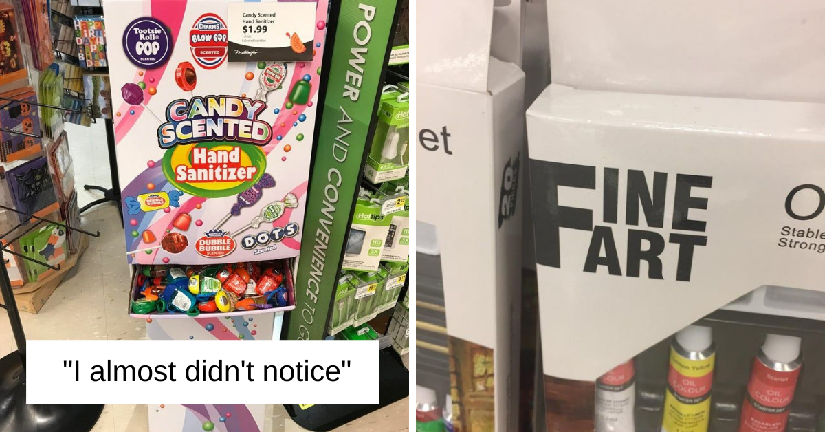
“You wanna poison some children? Because this is how you poison some children.”

These not only smell like candy, but the bright packaging also makes them look like candy, too. All I can be certain of is that they wouldn’t taste like candy.
“Not fine. Not fine at all.”

This seems like such an easily avoidable error. I don’t know why the F has to be so prominent, because it isn’t like it makes the design look good. Maybe they actually wanted to have FART in big letters on the packaging.
“It’s a trap!”

I feel like someone knew what they were doing when they pulled the ol’ switcheroo on these public washrooms. Also, that mural is very misleading. Entering a public washroom is not remotely like going for a nature walk.