


Let’s face it, not every design is a winner . Even if somebody out there tried really hard, their work could still end up falling short. The result of that is usually either hilarious, or downright confusing .
I’m sure whoever designed these things meant well, but it just didn’t work out. I’d like to say it’s the thought that counts, but it really isn’t.
“Don’t give candy to babies please.”

I’m sure whoever made this sign meant well. But you probably shouldn’t be giving candy to babies, even if it’s your own baby. They kind of don’t have teeth, after all.
Maybe that’s just nitpicking, though.
“Children’s water toy for bath/pool, with screws that rust.”

Someone forgot about the fact that this is a toy that’s supposed to be used in water. I’m sure the kids wouldn’t care about a little rust, but I can’t say their parents would feel the same.
“The mirror in the bathroom of my aunt’s house. I can’t see myself without being blinded.”

An attempt at a nice design was made, but it didn’t quite work out. The whole point of a mirror is to be able to see in it, after all. It’s gonna be hard with that bright light in the way.
“This roof over a picnic table that has a gap in the middle.”

On one hand, they have a nice shelter to keep you from being too exposed to the sun. On the other hand, that gap is gonna make it impossible to use while it rains. And will probably also let some sun in.
“‘No plastic is fantastic,’ wrapped in plastic.”

No plastic is fantastic. But saying that no plastic is fantastic while also having plastic packaging is just, well, misleading. And really strange.
I feel like so many companies just aren’t grasping the whole plastic-free thing.
“When you don’t want homeless to sit on your steps so you make it hard for you to get home.”

This is an example of when the intention was bad, and the execution was also bad. There are much better ways to keep homeless people from sleeping on benches or steps. Like giving them actual homes.
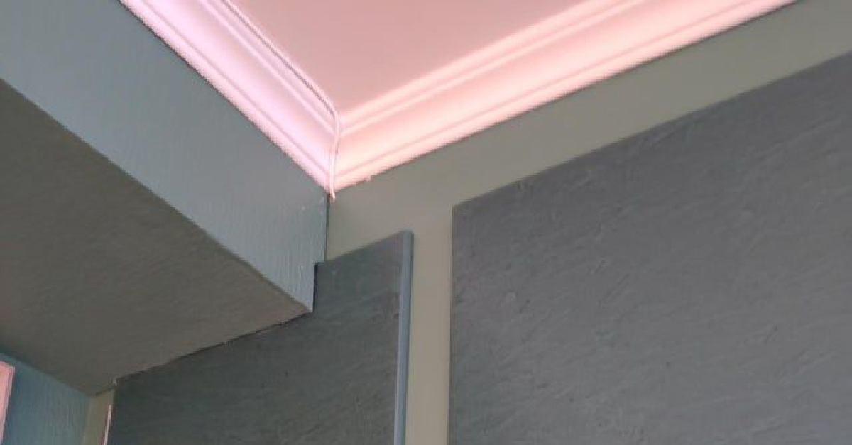
“Hotel thought this was a clever design.”

I can’t tell if this was an attempt at saving space, but it just doesn’t work regardless. For one thing, it’s so inaccessible. For another, it’s just plain ugly. A regular door at a regular height would’ve been just fine.
“A water fountain behind a fence at my school, the water fountain was there before the fence by the way!”

Clearly, someone forgot about the water fountain. Or, they just didn’t care. What started out as a nice place to stay hydrated on a hot day ended up being totally useless. But what can you do?
“Guess how many times I changed the channel or turned off the TV during my flight?”

If the answer is anything over 0, then it’s too many times. Sometimes, a design that’s supposed to be more convenient just ends up being less so. But hey, at least you won’t lose the remote.
“They renewed a park near my house. The pedestrian crossing now ends at a flowerbed.”

If you look close enough, you can even see that they didn’t bother to cut the curb on the other side of the road. Hopefully it won’t cause too many people to trip and fall.
“Hotel room has a massive pillar blocking the other side of the bed, also makes for a very cozy depression corner.”

Everything about this design is making me depressed, so the depression corner would probably get a lot of use. At least it looks like they tried to make this space functional.
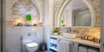
“Of course we need bidets after we pee, or are we supposed to poop there?”

I’d strongly advise against pooping in a urinal, but this is some pretty strange mixed messaging for sure. It seems like kind of a waste to have the bidets there in the first place.
“Thsakn.”

What could’ve been a pretty cute thank-you card ended up just being plain confusing. I’m sure whoever designed this tried their best, but sometimes that just isn’t good enough to be on a card you’re trying to sell.
“Looks like someone forgot to press the space bar.”

Warnings are pretty important. Not just for keeping people safe, but so that companies can absolve themselves of any responsibility if someone misuses their product and ends up hurt.
But, uh, you actually need to be able to read the warning label for it to count.
“Choose your own title: ‘Apparently all children are at least 5 feet tall,’ or ‘Police lineup training.'”

I’m not even mad at the fact that it starts at five feet. I’m just confused at the fact that it goes all the way up to 7’6″. Like, who or what is going to be that tall in a park?
“My bread was wrapped in paper, the same color and texture as bread crust. I had to spit it out.”

Whoever designed this bread packaging was clearly trying to be clever, but ended up falling short. I guess the lighting doesn’t really help matters that much either, though.
“Our neighborhood has every mailbox blocking the sidewalks.”

Look, that’s a pretty nice mailbox. But the placement doesn’t make any sense. Why have a mailbox in the exact spot people are trying to walk on? Might as well start walking directly on the street, I guess.
“This stocking that I’ve had for a while. Just… try to read the numbers from left to right.”

I’ve always been confused by Advent calendars that don’t have the days in order. Like, what’s the point? To confuse the kids? Where’s the fun in that?
“When you open the gum pack you rip up part of the QR code used for a giveaway. Took me quite a few tries until it somehow scanned the code. If someone is unlucky it rips up quite a bit of the code.”

This is some pretty poor planning. How do you expect people to enter your giveaway if they can’t actually access the code they need?
“One L? Yeah I don’t see this being read two different ways.”

On the plus side, most people will read that as “pool life.” But you just know there are going to be some jokesters out there who are going to take the lack of 2 Ls a little too far.
“To exit or not to exit.”

Sometimes an exit will tell you not to enter because it’s an exit. But this one is just plain confusing. It doesn’t even say it’s an emergency exit, which would’ve been all it needed, to be honest.
“Exhaust fan switch in corner of ceiling, behind a stacked washer & dryer that you need a long stick to turn on in my new house.”

You can tell that the people who designed this laundry room didn’t think things through all the way. That happens from time to time when you’re in DIY mode, though.
“The designer of the text on this box of detergent is useless.”

I know it’s supposed to say “use less.” But I couldn’t help but read that as “useless.” I wonder if it was done on purpose, so that people would read it, get confused, and then decide it was funny and buy the detergent.
I feel like it would have the opposite effect, though.
“Public binoculars for disabled people.”

This is fine and all. You know, except for that one teeny tiny problem. There’s a fence post directly in the line of sight of the binoculars. So much for accessibility. But that’s how it always goes.
“how should I open the door on the left?”

The more I look at this, the angrier I get. It would’ve made so much more sense for the person who did this to switch the hinges and get the door to open from the other way. As it is, it can’t even open!
“Terrible playground design.”

I actually have no idea what this is supposed to accomplish. In fact, I have no idea what the original intention could’ve been, other than someone hoped a bunch of kids would slide off into the street. Which would just be weird.
“My Eco friendly packaged toothpicks are individually wrapped in plastic.”

Having something self-proclaimed as “eco” friendly, all while covered in plastic, is a bit of an oxymoron. This is what happens when people treat sustainability as a trend, I guess.
RELATED STORIES


“Bike lane in a parking garage in Oslo, Norway.”

It’s bad enough trying to not accidentally back into a random pedestrian in these parking garages, but a bike is so much worse. Plus, you aren’t left with a lot of room to cycle if people don’t park within the lines.
“I have no idea what your number is, and why are you holding a sledgehammer?”

I’m sure this lawyer (?) wanted to help people out. But it’s kind of hard to do that when you leave out important info on your billboard. But I guess those things are too expensive to reprint.
“This stall door in a gas station bathroom.”

On the plus side, your face is still covered, so there’s a bit of privacy there. Like, not a lot of privacy, but also not zero. Still, maybe think about holding it in until the next pit stop.