


There’s something about truly awful designs that’s just so much fun to look at. Sure, they may make you want to wash your eyes out with bleach, but like, in a fun way.
You really have to wonder what went through the minds of the people who designed these things. If they’d designed them for me, I’d be looking for my money back.
“This sign that due to shade and letters being close to each other is almost unreadable.”

Someone didn’t think this signage through. It seems like it would’ve been a good idea in theory, but some things just don’t work out, no matter how much you want them to.
Welp, that’s a lesson learned for whoever designed this.
“These garbage bins placed on top of park benches to save space.”

I don’t understand how anyone would think this was a good idea. Look at how the garbage cans are completely overflowing, and getting dirt and other gross stuff on the seats. Whoever thought this was a good idea probably needs to go back to design school.
“I work at a hotel as a housekeeping manager. These HVACs are about 6 inches away from the bed. Imagine trying to make the bed.”

Why do I feel like there’s some kind of regulation that prevents things like this from happening? Like, aren’t HVACs supposed to be a certain distance from other furniture? I’m no expert, but it seems like a no-brainer.
“This sidewalk that people cemented stones to.”

Oh yea, because that isn’t a tripping hazard at all. Imagine trying to walk on that sidewalk. You couldn’t. Not unless you were staring intently at your feet the entire time. And don’t even think about trying to ride a bike or scooter on there unless you like falling on your face.
“The hooks in this shower curtain are sewn into the curtain so I can’t take them off to wash the curtain!”

I really want to know the thought process behind this decision. Who would think this was a good idea? It doesn’t even look nice. But the worst part is the fact that these curtains are basically un-washable, which means you’re going to get all sorts of shower gunk on them.
“This sign in my office causes me to have a small existential crisis every time I pass it.”

There’s something incredibly threatening about this sign. The fact that it uses all those symbols to censor some kind of swear word. But then in a separate sentence says, “your mess.” It’s confusing, it’s threatening, and it’s just strange all around.
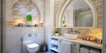
“Very… interesting window design on castle in capital city of Slovakia.”

So… someone actually put a window on top of a different window? Instead of, you know, removing the first one? There was no effort made here, and it really shows.
What a shame, too, because it could’ve been a nice building.
“‘Easy Peel’ you’ve done it again.”

These peel-off tops are great in theory, but I can’t be the only person in the world who has problems with them. They always seem to tear before you can even get them off, which makes no sense. It’s like the person who designed them wants us to fail.
“This is the sign for a building with street number 2333.”

So the building is numbered 2333, but the way the numbers are labeled makes it look like it’s confused. Like, it could be 23 or 33, but it doesn’t look like it’s all of that. An attempt to get fancy that just falls flat.
“The yellow sticky tab also says ‘to do.'”

Yeah, if you’re going to design a thing that has words on it, maybe don’t make those words a similar color to the background. It just seems like a waste of time and paper at this point. Though, at least these sticky notes are still usable.
“Fully organic *what*?”

I’m sure this is supposed to mean that their plumbers are real people and not robots or something, but it doesn’t make any sense. It almost feels like this plumbing company is selling its staff like they are groceries. And that’s not a world I want to live in.
“These benches at my university are tilted back and have no drainage system, so the water just sits there for up to days after a rainstorm.”

I’m surprised at how easy it is for people to get benches so wrong. Imagine thinking you’ve come up with a cool design, only for it to not work in the slightest. That’s what’s happened with this gross, wet bench.
“Well that certainly isn’t how batteries usually work…”

To be honest, I have no idea which way the battery is supposed to go. I rely on the little makers in the battery case to tell me. But this? This is like a living nightmare. This device will probably never work.
“Can’t open either of these at my new workplace, the door just hits the handle of the other cupboard.”

I don’t understand how things like this happen. When you design a kitchen, workroom, or any place that has cabinets, you have to take space into account. You need to be able to open doors and not have them get stuck on each other. Sigh .
“Some commas would probably help.”

There are a lot of ways this could be read. Smoking, bare feet, pets prohibited would make sense. But what about “smoking bare feet, pets”? Or “smoking, bare feet pets”? See, this is why grammar is important, even if some people think they’re above it.
“I have no idea how they turn this off.”

My guess is that this fan probably never gets turned off. It just wouldn’t make any sense. You can’t reach that switch without getting hurt by the fan blades (which spin pretty quickly, by the by). So, uh, yeah. Not good at all.
RELATED STORIES


“High school bathrooms are already wild enough.”

I can’t imagine people actually using this “stall” unless they were desperate. Because it has zero privacy. In all honesty, it’s kind of gross.
You know what? just tear the whole place down and try again. Preferably with a different designer at the helm.
“This weird SpongeBob jumping castle I found.”

Look, I’m a grown adult. But something like this would still give me nightmares for weeks. SpongeBob doesn’t look anything like this monstrosity, and the fact that it’s a jumping castle? For kids? I wouldn’t be surprised if Nickelodeon decided to sue whoever made this.
“To the i MOON lOVE & YOU Back.”

I love terrible signs like this. There are, like, a thousand ways to read it, even though you know what they were going for. It’s peak comedy. It really doesn’t get much better than this.
I actually can’t stop staring at it. A total train wreck.
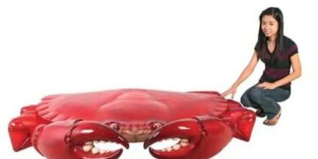
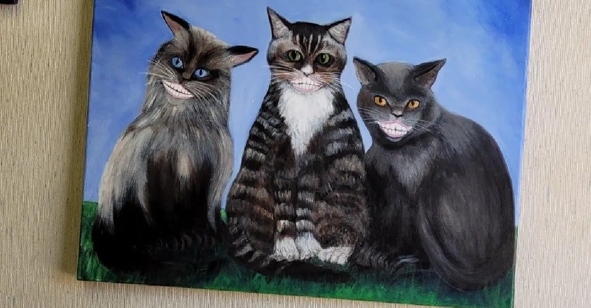
“In the waiting room at my dentist’s office.”

I… I don’t even know what to say. I guess it makes sense that it was in a dentist’s office, considering all the teeth. But. The teeth. That’s just so unnatural, and honestly kind of creepy.
Art is subjective, but this really ain’t it.

