


There are a lot of bad designs out there that’ll make you laugh, while others will just make you irrationally angry. There are some, though, that’ll somehow really bug you and make you laugh . At the same time.
You can find some of those crappy designs right here. It’s really hard to believe that people seriously thought of these.
I don’t think this says what they think it says.

I’m going to go out on a limb and assume that this plaque is supposed to say “native,” with the outline of the state of Maryland acting as the A. The only problem is, the state doesn’t look anything like an A. If anything, it looks like both an O and an L. Noltive?
Bad carpet in a bad bathroom.

I can’t tell what’s worse, the fact that this bathroom is covered in carpet (even the side of the tub), or the fact that the carpet is starting to lift. I mean, both of those things makes this super gross, so…
“If you open the closet door wrong, the knobs will get stuck and you can’t move either door.”

The fact that the room door and the closet door are so close to each other isn’t the problem here. It’s the fact that these doors just don’t work together. All they needed to do was use a different kind of door, like an accordion one or something.
But… but what if you need to go to the second floor?

Does this mean there is no second floor? Is it, like, a secret floor that you can only access if you’re a VIP? What’s the deal with this weird, janky elevator? I guess we’ll never know.
Yeah, this definitely doesn’t look good.

This would’ve looked good if each plate had a picture or a pattern on it. But the fact that they separated all those words like that is just… plain bad. You won’t be able to read a thing without straining.
“Washroom lock/unlock door buttons in the washroom of my university. Had to make sure that none of them were the emergency button before pressing.”

Yeah, the last thing you want to do while in the bathroom is accidentally set an alarm off. It would’ve been really cool if those buttons didn’t look like they triggered sprinklers.
Don’t worry, he just wants to give you a hug!

You can always tell when shopping malls make toys and rides that look like characters, but they don’t actually have the licence to use those characters. You can tell because they look like this bootleg SpongeBob: terrifying.
“The maintenance guy said they get a lot of calls from people unable to work it.”

Yeah, if I saw this thing for the first time and didn’t know that those little tabs on each side could open, I’d probably have no idea how it works. They could’ve just left the buttons exposed. It probably would’ve looked better.
“This track in Shanghai, China.”

It’s all fun and games until someone trips over the fire hydrant that’s in the middle of the lane, falls, ang gets badly banged up. They could’ve just not put a track there instead of doing this.
“This ‘Pikachu’ I found at a fair a couple years ago.”

Honestly, the fly near the doll’s nose is what’s doing it for me. It’s like the icing on the crappy cake. It turns this otherwise slightly unsettling bootleg Pikachu into a true work of art.
This owl doll is mostly fine, except for the mouth under its beak.

I feel like someone out there genuinely thought that an owl’s beak wasn’t its mouth. So this guy basically has two mouths, and that’s just not right. Marry Christmas? More like scary Christmas.
Are these… for people… or for animals?

The package design makes these cans look like they contain dog food. But the fact that they’re pork and beans and have the kind of nutrition facts you’d see on human food makes it look like it’s for people. So… which is it?
Get your steps in while you use the bathroom!

No bathroom needs this many stairs. In fact, if a bathroom has even one step up to the sink, it’s already lost. And this one has two separate stairs for whatever reason.
Everything about this one is really bad.

Well, not everything. The dog is cute, at least. Even though it looks like there’s a candy cane going right through its snout (instead of being in its mouth). The Santa hat is also a big swing and a miss.
“Local restaurant has this awful online menu, most likely posted up at their shop too. The colors/outlines and the vertical text really kill me.”

There’s nothing about this menu that couldn’t have been solved with an extra page of space. On the plus side, you just know that the food they serve here is probably fire.
Okay, but what if you want cold water?

These kinds of taps are really annoying because your options are basically hot, lukewarm, or off. Or, if you can manage to get the cold water, there’s next to no pressure. So annoying!
I dare you to try and read this.

This is, like, the final boss of confusing window signs. I’m fairly certain that most of the words here are either cut off, or were just incomprehensible to read in the first place. And the fact that it’s in all white? What a nightmare.
This definitely reminds me of the European city of PAAIS.

The worst thing about this hat is the fact that the A in Paris already kind of looks like the Eiffel Tower, and yet they thought to put it as the R instead. The second worst thing about this hat is the gross misuse of rhinestones.
RELATED STORIES


“I saw this at a bird zoo.”

In defense of this terrible bird stand-in, they were doomed from the start. There’s no way to make one of these look good, not if it’s supposed to be bird-themed. This is at least a bit better than if the cutouts were in the birds’ faces.
“Received my ‘flannel’ pajamas In the mail the other day. Had to return them for fear that wearing them over the holiday weekend would give my 80-year-old FIL a heart attack!”

I don’t see how anyone could market a top like this as pyjamas. It looks more like the kind of shirt you’d wear with a tank top underneath. And that would just be pointless.
“Ah yes, let’s add gray text on a gray background.”

If you’re someone who actually cares about the washing instructions for a piece of clothing (in other words, if you’re more responsible than I am), then you’ll probably hate this.
Actually, I think we can all agree that it sucks.
“Advent Calendar with more dates than slots.”

Actually, everything about this is bad. From the way the 14 and 15 are missing, to the way this is ordered. The 24 should really be on the left, and then the numbers should be counting down from left to right.
This balcony that you can’t actually stand on.

It would be one thing if there were just a random balcony on the side of this house. But the fact that it also has a super skinny door leading out to it makes it so much worse. I don’t think anyone can actually stand on it.
“The most pointless size chart in existence.”

You know how a size chart tells you what size you should be wearing based on your measurements? Well, forget all that and just use this chart instead! It’s not like anything has to make sense , after all.
“Ah yes thank you for the comparison I can now picture the size of the remote!”

I have no idea what that convertible needed to be there. Is the ad trying to say that the remote is the size of a car? Is the car the size of a remote? Did the seller just want to show their car off? Why!?
“Subway’s new lid closes the straw.”

At this point, they might as well leave the lid off entirely. At least that way, you’d be able to use the straw.
…Why do I feel like that’s something Subway would absolutely do?
“This stall door in a gas station bathroom.”

I wish I could tell you what’s going on in this picture, but I really can’t. I literally have no clue who would think that having the bathroom stall doors be this short was a good idea.
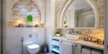
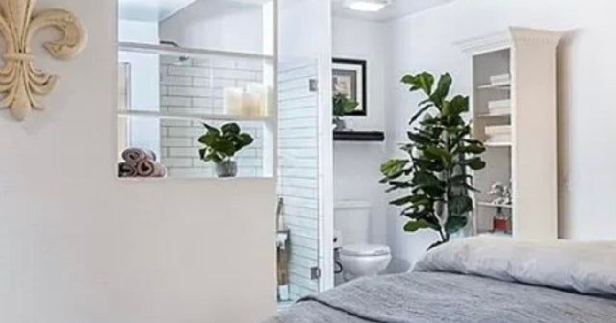
“Went to a house viewing and saw that the bathroom in the master bedroom had no door…”

Sure, the lighting and flow of the room is great, but would you really want to be sleeping this close to your toilet? With no door? Yeah, didn’t think so.
If only people cared more about doors and walls…
You can tell they tried *really* hard to make this look good.

They tried, and yet it just doesn’t look good. Sure, Chicago mix popcorn and deep dish pizza are what Chicago is known for, but that doesn’t mean you just slap them onto a tin and call it a day!
The popcorn at least kind of looks like a heart, but that pizza slice is totally useless!
Oh, and did you notice the best part? The tin is full of mints .
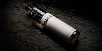
What, it’s just a water bo- oh. Oh no.

I strongly advise anyone who comes across a bottle like this to not take a giant swig from it. Because that isn’t water. It’s ethyl alcohol. Sure, the smell might tip you off, but still.

