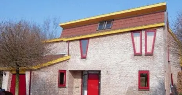
Have you ever wondered what a really ugly house in the Netherlands looks like?
Wonder no longer. Launched in April 2015, @uglydutchhouses documented the worst of the worst . We’re talking brick, we’re talking loud colors, we’re talking MOSS. It showed off the ugliest of Dutch architecture.
And then, just like that, it disappeared. The account stopped posting in December 2015, but that doesn’t mean we can’t appreciate all the ugly it found during its brief tenure. Let’s check it out.
Let’s start off with this inexplicable beauty.
Because who doesn’t pair their brick walls and floor to ceiling windows with a straw roof?
Even if it’s not straw, it sure is ugly as sin. Why is the roof so LARGE?
Well this looks familiar.
It’s a building, it’s a house, it’s…an IKEA. Tell me you didn’t look at this and immediately recognize that shade of IKEA blue. God, this is seven levels of awful. Don’t do this to your neighbors.
Why not spice up your brick with some more brick?
So, the thing I’m learning about Dutch homes is that they sure do love some friggin’ brick. It’s nice that they decided to switch up that dark brick with some uglier, lighter brick. Variety is the spice of life.
I can’t decide if this is bad or amazing.
On the one hand, it looks like a child designed this house. On the other, it kind of looks like a haunted house for rich people, which I’m into in a big way.
Nickelodeon designed this house.
And then they very clearly abandoned it. According to the account:
“Yes, this is a house. Yes, people actually live here and yes, the windows weren’t even placed symmetrically.”
Thanks, I hate it.
Why…
I feel like my eyes are being tricked with this one. It’s almost like they don’t know what they’re seeing, you know?
I THINK the thing on the back of this house is solar panels, but I’m just…so puzzled by the design of the rest of it.
“Yeah, gimme that roof special.”
This is how I imagine this happened:
“Sir, I’m sorry, it looks like you want to put roofing tiles all over the front of your house? Are you sure about this?”
“Absolutely. Ring me up.”
That’s one way to make your house stand out.
Imagine telling an Uber driver which house is yours. “Yeah, it’s the one with the bright green and yellow trim. Looks kinda like snot.”
People, just because you CAN, doesn’t mean you SHOULD.
I need to know why this was necessary.
What about this building necessitated putting those windows on an angle? Why not just make it, you know, perfectly vertical? Walking in that house must be a nightmare, especially if you’re drunk.
I’m not sure about this one.
“After her encounter with the wolf, Little Red Riding Hood commissioned an architect to build her this safe house,” the account said.
Guys… do I like this? I actually think I like this house. It’s weird, but it’s kind of cool.
When your house needs a crystal tower.
Tell me this doesn’t look like someone who does Tarot readings for a living designed a house. Is that supposed to be an atrium up there, or a greenhouse? Guess we’ll never know.
Submarine chic.
I’m so sure that this house could lift right up and sink right to the bottom of the ocean, you know? Divers could use this to pressurize their bodies.
What’s with all these roof houses?
Why are there so many houses that are like…all roof, and no walls? I’m gonna need the Netherlands to explain their design choices to me. Yes, I mean the entire country.
Can I take your order?
I gotta say, it’s a bold choice to do your home’s trim in the classic McDonald’s colors. I hope this is a loving homage to the golden arches, tbh. Otherwise it’s just bad taste, and I can’t handle that right now.


