Some people really try their hardest to make the best designs possible, only to fall flat. Other people don’t try at all, and you can tell by how their designs just feel lazy and bad.
But there’s a third group. A group that sets out to make the worst designs imaginable. On purpose .
Whether these designs were bad on purpose or not, though, we may never know. But, like, they’re still pretty bad.
Which came first, the post or the stairs?

It almost doesn’t matter if the post was put in before or after the stairs were. It doesn’t change the fact that you can’t really climb up those steps. Seriously, who decided this was a good idea and actually did it?
This path that leads to… a wall?

Nope, not a door. Not a gate. Just a wall. It almost looks like that section of the wall was put in after the others. But… why? Why bother having a sidewalk if it’s going to lead to nothing? Why put an obstruction in the way of a path?
A gate without a fence.

I’m not sure what’s worse: a wall that blocks a path, or a gate with no fence around it. I’m not really sure what this is for. It’s not like it would keep anything in or out, since you can just walk around the gate on either side.
This staircase that’s just a *little* too confusing.

My guess is that someone put that diagonal railing in after the stairs were already built. But… why? To create two lines? That could make sense, you know, if the staircase wasn’t one huge tripping hazard. Watch your step on these stairs!
Since when did Duracell have a creepy bunny mascot?

I was today years old when I learned that Energizer isn’t the only battery company with a bunny mascot. The Duracell bunny has been around since the ’70s , and it looks just as creepy today as it did back then.
No wonder we see the Energizer bunny more often.
The way this bus shelter design covers up the CTA arrival times.

Apparently, this is an elaborate Nissan ad. So, a car company created an ad that covered up important information on a bus shelter, and saw no problem with that.
I mean, if people bought cars, they wouldn’t need to take the bus. I can’t tell if this is clever or just dumb.
See more… Domo re…

I just. I’m in utter disbelief. Somehow, this bus ad ended up making such an obvious mistake. One that made the text almost unreadable. It might take you more than a bit of time to realize that it’s supposed to read, “See more. Do more.”
When what they’re selling doesn’t match the picture they use.

This spoon could be a cute gift. “I Cerealsly love you” is a pretty neat pun, and would work for a spoon.
But that’s not what the spoon in the picture says. Why would anyone buy that if they have no idea what they’d actually be getting?
This anatomically impossible spider skeleton.

Okay, I get it. Skeletons, spiders, Halloween. Spooky stuff. It’s all going to be out on the shelves for the next several weeks. But that doesn’t mean I have to like this spider made of bones.
Spiders don’t have bones! They’re invertebrates. This is just making me mad.
The way this was written… doesn’t make sense.

I think this ad is supposed to read both “I’ve pulled the alarm,” and “the alarm has stopped the train.” But the way it’s written doesn’t make any sense. Because it either reads “the alarm has stopped the train,” or “I’ve pulled the alarm has.”
Why did they make the chicken sandwich have so much hair…?

Yeah, I don’t know about you, but I can’t stand this. There’s something about all the hair around that chicken sandwich that’s just… nasty. They could’ve done a way better job with this ad if they just tried a little harder.
Hmm, I wonder what tool you’d need to open this scissors set.

Don’t you hate when the thing you bought is the thing you need to open a package? What if you didn’t already own a pair of scissors? It’s almost like people design things like this on purpose, like they just want to see the world burn or something.
This toilet design that’s horrible in every sense of the word.

If there’s one thing I can’t stand, it’s toilets with weird designs on them. Like, why would anyone think this was a good idea? It’s ugly, for starters. And it just looks really uncomfortable. Like, it looks absolutely disgusting.
This is wrong on multiple levels.

Don’t get me wrong, the idea of a store that sells nothing but Star Wars merch sounds cool. But the sign. Oh, the sign. Not only are all the letters unevenly spaced, but it’s missing an S. It reads, “Star Wars Tore.” A swing and a miss.
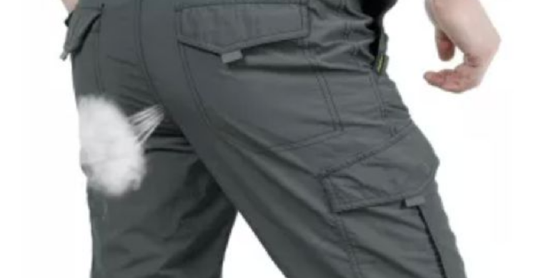
It looks like this fabric is “breathable.”

Yeah, I’m fairly certain that when an article of clothing is considered breathable, it doesn’t mean you can, uh, breath through it. Not only is this weird display of toilet humor tacky, but the whole thing is such a dumb design.
This super confusing skeleton skirt.

I have to wonder if the person who made this knew how anatomy worked. Like, I’m sure it’s supposed to be some kind of tail skeleton, but it just looks wrong. It could be because the pelvis is so unnaturally high up, though. And, like, really small?
I’m sorry, but what is this?

This entire setup really confuses me. You park in those spots, you probably won’t be getting out of there anytime soon. It also looks really tough to navigate? How do you get around those other spots?
Honestly, everything about this parking garage is giving me a headache.
That one urinal that might be a little *too* cozy if you ask me.

I don’t use urinals, but even I could tell you that this one is too close for comfort. It’s too close to that other urinal, and to that wall too. Sometimes, I feel like the people who design public restrooms just stuff them with toilets and urinals willy-nilly.
Would actually be good, but there’s just that one thing.

I can’t believe this wasn’t done on purpose. Like, this has to have been intentional. The name is Chopstix, and the logo didn’t decide to use chop sticks. It would’ve been so easy. And yet. And yet they used a fork and spoon.
Either this map is way off, or we’ve gotten our geography wrong this whole time.

I’m honestly not even sure what this map is trying to tell us. None of those countries are in that area (except Russia). Like, why would they have a map of the world and then not actually use it?


