


The public tends to forget just how much thought and deliberation is put into the designs of every single thing around us. From the chair you sit on to every ad on the web, an entire team was dedicated to making it as perfect as it could be.
Some things, though, did not receive nearly as much consideration as they should have. The results of that are seen here, with 20 designs so bad we’re cringing away in disgust.
“Yellow as a container color for gallons of drinking water.”

This is a surefire way to make sure no one drinks out of the office water cooler for a long, long time. Sure, it’s probably not what it looks like, but what if it is? Who would want to risk that?
“Those traffic signs.”

In the face of this, what else is there to do besides have a mini-crisis for a few seconds, look around in panic, then just turn around and frantically look up an alternate way of getting to your destination?
“This wall at my gym.”

Um, I was never planning on losing my eyes, but thanks for the advice? Also, I don’t know what an “unc ommon” is or how to be one. You’re saying I’m doing excellent though, amazing even, so I must be on the right track.
“Is no one proofing these things?”

It sure doesn’t feel like it, huh? Though it is annoying sometimes, it also makes for some truly funny sentences like this one. It’s like the sign is having a stroke and we can do nothing but watch and nod.
“This sink at my school.”

Can you really call it a sink if it doesn’t do the one sole thing a sink is supposed to do? I fear for what the hollow shell of a sink has actually been used for rather than washing hands.
“We have 14 letters, let’s turn it into a clock!”

With a name like Blackhorse Lane, there are so many cool signs you could have had done up, but this is what you settled on? Knowing the time is not worth looking at that atrocity of a design, avert thy eyes.
“What in the world does this sign from my friends wedding mean?”

I was desperately trying to find a pun in there, but I fear they really do think matrimony is spelled matrumauney.
Also, the timing chart is so far from comprehensible. Just when I thought I had figured out the format, it threw a wrench in. What is happening here?
“This track in Shanghai, China.”

Not only is it a track with a harsh turn, which I imagine must be awful for runners, but that fire hydrant is a broken foot just waiting to happen. Maybe put a hurdle there so jumpers can get some practice in too?
“This toilet paper dispenser.”

Oh my god, what? Who thought of this? The idea was probably so it’d have to be changed out less, but it looks way too bizarre that I feel more and more uncomfortable the longer I stare at it. This just isn’t okay.
“Winter sucks.”

As the resident winter hater, I agree! But I have a feeling that’s not what this company was going for.
Though, it would be pretty funny if they just started blasting their personal opinions on the store windows. “Winter sucks!” “I hate baseball!” “Pumpkin pie is overrated!”
“[My HelloFresh] meal came with 8 carrots, all individually wrapped.”

The comments were filled with debates regarding which is worse, the gratuitous plastic waste created by meal prep companies like this, or the gratuitous food waste that these companies try to help reduce?
There’s no right answer, really. Everything sucks no matter what!
“My pizza shaped playing cards aren’t in perfect eighths.”

Did they really make a pizza-themed gimmick deck and think nobody would want to actually put the pizzas together? What’s even the point of it, then? They’re disgracing both the art of cards and the art of pizza with this.
RELATED STORIES


“This alphabet thing I have that doesn’t have a W.”

Not only is is missing a letter, but you don’t even know what it is! There’s a lot of confusion going on here.
Hatever. E could do ith less letters anyay. Ith enough time, everyone ould get used to this.
“It’s beginning to look a lot like… Hristmas?”

First they’re eliminating Ws, now Cs? Why is there such a movement to scrub away half of the alphabet?
Hen it as just the one letter, sentenes ere still legible, but it’s only going to beome harder and harder the more e hoose to eliminate!
“Good thing that door is there to… ummm… idk.”

Someone tried their hardest to find a positive spin, hoping it was one of those cool glass doors that turn foggy when locked, but the uploader returned to confirm they are not those. These are just useless panes of glass that hide absolutely nothing.
“Come again?”

This is the world’s hardest game of spot the difference. Many people believed this to be a printing error, but that doesn’t mean it suddenly makes sense to the person who owns this, they still don’t know what the incorrect placement of the leg is!
“Stop quitting smoking.”

Are you thinking about quitting smoking? Stop! Cease those thoughts immediately. Together we can stop the urge to stop smoking, and you can help.
Really, though, if you’re thinking about quitting smoking, do it. Don’t listen to this poorly designed double-negative sign.
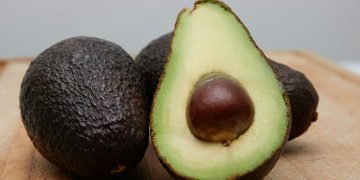
“To be fair they really are very large cucumbers.”

I wouldn’t call her expression ‘inspired’, nor have I ever seen anyone make a face even remotely similar to that in reaction to cucumbers. I love ’em, but they’re perhaps one of the least surprising vegetables out there.
“A clock with black hands on a black background. (Sorry about the huge reflection).”

If anything, the huge reflection proves how poorly designed this product is. I spent a good few moments thinking it was one of those security mirrors they use in store aisles before I re-read the title and squinted until I saw the hands.
“Hey dude where’s my car? I think it’s on yellow man. Crappiest parking garage design at a local hospital.”

They didn’t have to stick to the color thing, they knew that, right? They could have just numbered the floors and left it at that? Or at least have picked some different colors to stop people from getting turned around?

