

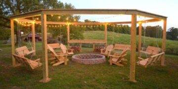


A good design is like a breath of fresh air. They almost always make you happy. A bad design, on the other hand, is like a movie trailer that gives away the whole plot. Nothing but a disappointment.
These terrible designs may leave you feeling a little lost, but they’re at least pretty funny. Somebody somewhere failed big time with these.
RELATED STORIES


“Urinals so close to the sink.”

I love how there’s so much room in this restroom, and yet all the urinals are squished together right next to the sinks like that. Looks like somebody didn’t plan this out very well.
“Urinal even closer to the sink.”

This feels like the sequel no one asked for. To be honest, I think this is a lot worse, because you can’t even use that sink. Good thing there’s another one right next to it.
“Go ahead I dare you. Bike lane ends in oncoming traffic.”

You can totally tell that city planners didn’t think bike lanes would ever be a thing when they started planning city streets. Things like this happen way too often.
“My sibling found this at work; it is near impossible to get the soap on your hand.”

I think the funniest thing about this is the fact that they definitely could’ve installed that soap dispenser a little higher. Or, like, in a completely different spot.
“The queen mug.”

According to OP, that crown doesn’t come off from the top. So, like, what’s the point of this mug? Obviously you can’t drink from it, which in fact, defeats the purpose of a mug.
“A shirt with a design that looks like someone spilled coffee on the shirt.”

I don’t see why anyone would want to wear a shirt like that. I’m also wondering if it was actually stained, and the store owner just decided to keep it in the window. Either way, I don’t see it selling quickly (or at all).
“I can think of something better to put on this sign.”

I feel like these kinds of signs are popping up in a lot of malls, and I just don’t get it. Like, why would you put a QR code to access mall hours on a sign, instead of just putting the hours on it?
“The push/pull lettering can be seen from both sides.”

There are about a thousand ways they could’ve made that clearer. But the fact that whoever printed those words on there didn’t think of any of them just shows they weren’t doing a great job.
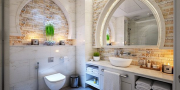
“Transparent toilet seat and cover featuring ‘dried, dead flowers.'”

Um, that’s horrendous. I’m sure the toilet is nice and clean, but at a glance it looks like it’s covered in, well, in toilet stuff. Why people have seats and covers that are out of the ordinary is beyond me.
“What are the Simple Directions?”

I guess the company that made whatever this stuff is doesn’t want you to know how to use it. Either that, or they’re just really into telling you how great it is.
“The seats where you are blinded by a wall.”

I seriously hope people don’t get assigned those seats. I mean, unless they like staring at a wall instead of the action on the other side.
“Who thought this nightmare fuel was a good idea?”

I don’t know what the heck these things are supposed to be, and I don’t like them one bit. I think some ideas are better off being left in the drafts.
“Toilet paper in another room. I guess you can take it with you when you need to go. Just don’t forget it…”

No, this is just plain bad. There’s no reason not to have the toilet paper closer to the actual toilet. Like, what if you needed more than what you grabbed?
“6 tuning keys but only 5 strings.”

I bet you anything that the person who designed this guitar statue thought no one was gonna notice. But you don’t have to be a guitar player to see that this is just wrong.
“‘Oh crap, I’ve broken another hip!'”

There’s something really funny about bad bathroom designs. It’s like people never run out of ways to completely destroy the flow and functionality of them. Like, this random step is just amazing.
“Bathroom at a local bar. Yes that is carpet.”

I almost feel like I can smell this picture. Like, that rug is probably so full of water, pee, and who knows what else, and I bet it doesn’t get cleaned all that often.
“Destroy the instructions when you open the product.”

You know, they totally could’ve found a better spot to put the instructions. I guess they didn’t really think that through.
“Good luck reading this.”

It takes a second, but it is legible. Still, considering how serious the message of the sign is supposed to be, you’d think they’d put spaces between the words.
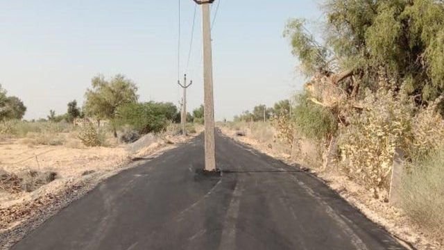
“Electric Pole in the middle of a Road.”

Uh, that’s just weird. Especially since it looks like that road was paved pretty recently. They couldn’t have moved the pole somewhere else?
“A great feature for any bar, or place that serves alcohol, is a clear glass wall.”

Yeah, I can see how this would cause a lot of incidents, even with that sign. Maybe they should consider putting a solid wall in there.
