Not all mistakes are world-altering catastrophes that bring about swathes of destruction in their wake…some of them are just people being a little bit dense from time to time.
So, from designers who thought that the human skin was a sort of onesie to individuals who mixed up their legs and their arms, here are 20 silly mistakes that would have been ridiculously easy to avoid.
“The bones aren’t spread.”

Now I cannot stop imagining what it would be like if we could move our skeletons independently inside our skin, as though our skin were just a big fleshy onesie. Great, I am not going to be able to stop thinking about this and creeping myself out now.
“That was a great place for the number.”
![Image credit: Reddit | [Deleted]](https://static.diply.com/1Lr1z8UT2AbDoJPIaWkx.png)
There is just no way that someone designed this, stood back, looked at it and thought, “Yep, that’s the sign that we need.” It is like they typed it in Microsoft Word and then just threw that big “2” box in the middle.
“Halloween just got a little more interesting.”

And this is why it is always important to make sure that you use the right font when you are designing something. Sure, typography may not be the most interesting of things, but in instances such as these it can stop you putting very aggressive signs on your front door.
“Gotta love the irony.”

All they had to do was drive carefully…well, that and not flip their car over I suppose. Although, maybe they could not read this sign due to the italicized font. If this was in standard Arial then this might never have happened.
“I put the ramp in place boss.”

Why would they not just put the ramp on the right hand side? Then they would not have to cut a needless hole in a ramp to fit around a tree thus rendering half of the ramp useless! And why bother painting the bottom of the tree as well?!
“Told her my name is ‘Stephen…with a P.’ She heard…”

I do not even know how you end up with this from hearing someone say “Stephen with a p”? I thought that the woman who wrote this down may have been taking the piss, but the person who posted this wrote, “I am not sure she [was] the prankster type.”
“The worst sidewalk.”

Look, it is easy to simply say, “Why didn’t they just go straight,” but… Actually, yeah, that is a pretty fair assessment of the situation. Perhaps there was a tree there when they paved this road, or just a very belligerent man?
“He’s ok because he lid.”

Ah yes, what a beautiful sentiment. The phrase “He’s ok because he lid” just speaks to me on a spiritual level! I also love that the gold writing reads “Sbren Sbeve,” which sounds like the words to a demonic incantation.
“You’d have to taste it to know.”

I guess that it is just a 50/50 shot at which one you are going to get in this particular meal. Well, it is that or this place has successfully bred a hybrid animal that is half chicken and half cow.
Mixing Drinks In The Worst Way…

“Instead of rinsing his cup between drinks, my boyfriend will just refill it with whatever since it ‘mixes in his stomach anyway.’ Pictured is his glass of ‘water’ after milk and Oreos,” explained the poor, tortured soul who posted this.
“Gas station in Nebraska. The station’s color scheme was red. They tried to get artsy.”

It looks like Leatherface or Dexter were the artists that designed this terrifying bathroom door. Apparently, the men’s bathroom door was exactly the same as this one, so they really were going for a uniform horror movie aesthetic. A bold choice.
“That’s not how any of that works.”

These clocks are not even consistent within the constraints of their own rules, it is just chaos! Although, maybe it is time that the concept of time was revolutionised a bit, bring it into the 21st century with some added chaos!
“Faces printed on car windows will never work out.”

I think that this is actually working spectacularly! It was also pointed out that this unsettling woman looks like the Pale Man monster from Pan’s Labyrinth, and now I cannot see anything else. Get into this taxi if you dare!
“‘Aesthetic’ urinal covers in public restroom must be touched with your hands in order to open.”

Why would they put this in place? A few people did see solutions to this problem, with one person pointing out, “A motor for [the] cover should’ve been connected to the sensor.” Although, I think the easiest solution was simply to put a foot operated mechanism on it.
“Trouble with utensils.”

The person who designed this sign must have a real problem when it comes to eating soup if he keeps mixing up forks and spoons. Also, you don’t want to put too much love in your recipes, it has a very strong taste that some would describe as overpowering.
What In God’s Name…?

I had to resort to asking for help working out what this one is supposed to say, and someone eventually figured out that is says “Yellow Edge” from the top and the bottom…sort of. What an absolutely horrific design choice!
“The legroom for this poorly installed toilet (TP for scale).”

I can only imagine that using this toilet is far from a relaxing or pleasant experience. No legroom when using the toilet is a problem that a lot of people have apparently faced, with someone writing, “[Friend’s] cabin was like this. [Had to sit] either side saddle or feet in the tub.”
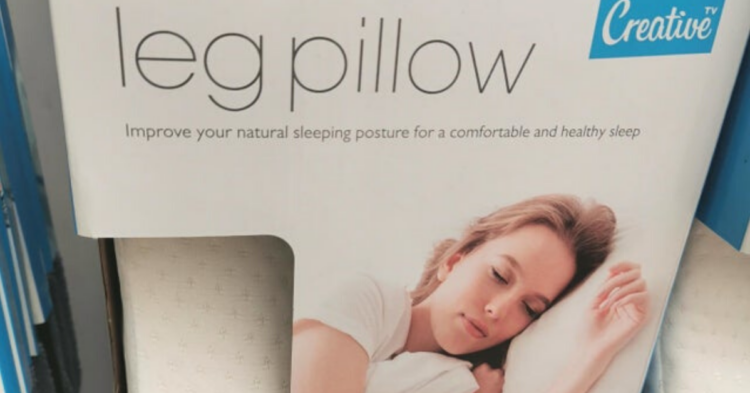
“The picture for this leg pillow show… A regular pillow of the non-leg variety.”

Well, there is no way to know that the woman pictured on the box is not still using the leg pillow! Maybe they just did not want to show it and preserve a little bit of mystery about the product?!
“This disgusting arch in my friends house.”

There were a few people who claimed that they quite liked the “off-centre aesthetic.” However, those people are objectively wrong and they ought to be ashamed of themselves quite frankly! It is even more annoying how well built the arch is.
“Did you want salt or pepper? Wrong!”

I think that you would just have to swap the contents around and forget about the letters on top. This reminds me of a friend of mine who put salt in his coffee once as he said, “It said ‘s’ on it and it was next to the pepper so I assumed it was ‘sugar.'” Still baffles me to this day.


