Logos are an integral part of advertising . Consider the McDonald’s arch or the Nike swoosh — each provides the customer instant recognition as well as communicates an understood implied promise of quality.
Sometimes, however, logos can wind up doing the exact opposite of what brands had hoped. Have a look and check out these 15 logos that somehow passed the test, when they shouldn’t have.
A most unfortunate acronym.

Steve Taylor is clearly the most wholesome guy on the planet. How else could anyone paint STD on the back of their truck without even the slightest glint of irony? The man must be good at what he does.
Word jumbles as signs are never a good idea.

It took me almost five minutes to realize that this sign is supposed to say “Steak n’ Lobster.” If I was passing this hungry on the street I would’ve given up and just walked next door.
This logo doesn’t inspire confidence.

I can’t decide if this is just laziness or pure brilliance. You’d have to reason that if their logo was so crummy that the craftsmanship would have to be outstanding, right? Does that make any sense at all?
Square Enix may want to rethink their branding.

I don’t know what a “SQEXTOY” is but I am almost 100% positive that I don’t want to stick around to find out. It sounds a little too futuristic and voyeuristic for my taste.
One of us is very clearly confused.

I’m very sorry but your logo most assuredly doesn’t not say “Jazz Addicts.” In fact, I’d wager that whoever you found to make those shirts for you absolutely despises jazz music to its core.
What else is Beaver Liquors selling?

I really don’t think I have an overly dirty mind, despite what you may believe after reading this list. I can’t be the only one who sees nothing but a busty pair of breasts and a skinny waist when I look at this sign, can I?
Just what exactly is on the menu?

What in the Anne-Geddes-hell is going on here? Is this company actually saying that they cook children?! How is this not a form of child abuse putting a baby into a giant potato pot?
I think McDonald’s is liable to sue somebody.

I will forget the color of my mother’s eyes before I forget what the McDonald’s arch looks like. You can color it red all you like but you aren’t fooling anyone at all.
Is this a log or did the restaurant fail a health and safety exam?

If I’m walking past a restaurant, trying to decide whether or not to stop in for a meal, and I saw a giant “F” displayed in the window — I’d take my business elsewhere.
Probably not the best advertising for a fitness studio.

Yes, I understand that the name of the studio is “FitForever” but you can’t tell me you don’t see it. The fact that the little person is slightly on the portly side makes it even better.
QC Pop are confusing the heck out of people.

I don’t make a habit of picking such low-hanging fruit but I have to say it — that sign says “POOP.” I don’t care what you say; don’t try and tell me otherwise.
A most unappetizing logo.

Before you completely give in to your dirty mind, let me first say that this man is drooling while eating sausage links. He’s not doing what it looks like he’s doing… as hard as it might be to believe.
This is most definitely not the message you want to be sending.

Looking at this photo, best case scenario — this young lady pooped herself. Worst case scenario…well, the worst-case scenario is…that it’s something else. I can’t get into the gory details but I don’t think it requires that much imagination.
This is the logo for a Catholic boys school.

What more can I say? Sometimes the universe has an incredibly dark and ironic sense of humor, I suppose. Regardless, I’d be sewing a new patch as quickly as I possibly could.
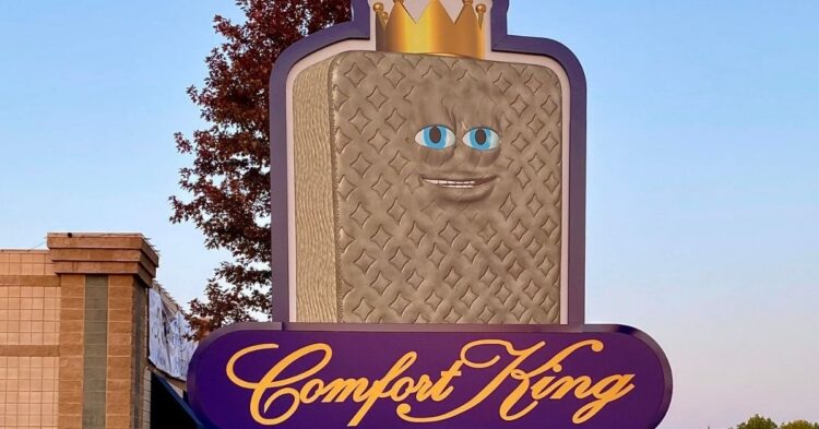
When your mascot looks high as a kite.

I’m not even going to mention how creepy this giant mascot looks, and instead, I’ll just choose to focus on how incredibly baked it appears to be! What kind of message are you sending to your customers?


