


A good design operates almost like a well-oiled machine, in that it works so well that you barely notice it working .
On the flip side, bad designs have a way of sticking out like a sore thumb . The only way to deal with this, really, is to take a pic and share it online so others can experience it for themselves.
RELATED STORIES


“These parking spaces that are completely inaccessible to cars.”
![Image credit: reddit | [user]](https://static.diply.com/4d185204-bcf0-4fa7-9c6e-2f9341efa247.webp)
There’s something about this orphaned parking lot that makes me sad. It has the painted lines and the concrete dividers and everything. If someone would just give it a chance and make it more accessible, I’m sure it would be a great parking lot.
“Classic American move.”

There’s no shortage of flags that look a lot like the U.S. flag . But c’mon, if you’re going to be super patriotic about the good ol’ stars and stripes, you need to keep things straight. Remember, the U.S. flag is the one with lots of little stars.
“Bright but brief.”

I really hope the person who designed this did it with tongue planted firmly in cheek. I mean, otherwise, how is this supposed to be a hopeful image? It quite literally shows someone walking into the light of an oncoming train.
“How not to install a metal roof.”

With the right tutorials, it isn’t that hard to install a metal roof . One critical thing to remember, as seen in this pic, is that the screws are supposed to actually attach to something.
“Ok, it’s not an easy job but c’mon!”

Bricklaying is an ancient skill, one that’s likely just as relevant now as it ever was. There are examples of good brickwork, examples of bad brickwork, and then there’s whatever this would count as.
“Got a haircut 3 days before my wedding…”

If this guy has fast-growing hair and takes the right vitamins and nutrients , he might have just enough time to turn this bald patch into a slightly less bald patch in time for his wedding day.
“Umm just keep it then….”

On one hand, it’s nice to know that a donation as small as five cents will make a (small, admittedly) difference. But if nickels are so helpful, maybe this charity should hang onto them instead of mailing them to random people.
“Oh lord, I don’t know what to say about this situation.”

I’m a bit baffled here. This is presumably a donut place, so why are they so willing to stop making donuts just because of one complaint. Also, who complains about the smell of fresh donuts?
“Letters are not aligned well. But the water is fart free!”

One of the biggest design trends of the 2010s, one that continues into the 2020s, is lettering in this style. Sometimes function follows form, though, and the message gets a bit garbled.
“Local furniture store.”

Here’s another example of the bougie lettering, only this example somehow looks more tired and lazy than the last. Is this a “ho ho” Christmas greeting? Something to do with “home”? Maybe the person who set this up is a gardening enthusiast who simply misspelled “hoe.”
“The positioning of the mirror and urinals in our office building. This is the main hallway.”

I’m not sure whether builders and architects consider mirror angles when they’re laying out the plans for washrooms. I’m sure some do, but as evidenced by this pic, there are also many who don’t.
“It says America, with the US flag and the Statue of Liberty, but with the map of Mexico.”

A lot of the visual stuff here specifically deals with the United States of America. At the same time, Mexico is part of the Americas. I’m not sure if this is an example of something that’s technically correct, or just a total foul-up.
“100/0 renewable or 10% renewable?”

You can read this sign in two different ways, but neither one of them really says “100% renewable,” which is what I can only assume was the intended message. Maybe it truly is only 10% renewable and they wanted to make it look a little better.
“Oh my, that’s terrifying.”

When it comes to professional headshots, some Photoshopping is to be expected. After all, you want the lighting (not to mention your face) looking as good as it can. But there’s a line between tasteful, reasonable edits and turning yourself into a soulless automaton.
“I’m currently on vacation in London…”

This souvenir was already kind of a fail, because it rendered Big Ben in some inaccurate colors. Then I looked at the base and saw the spelling. And no, there is no place that’s called Lodnon , so it’s definitely an error.
“I didn’t understand why I keep stumbling when going up, then I took a closer look at the stairs.”

Even the most sure-footed person on the most secure stairs is bound to stumble now and then, but this set of stairs is just an out-and-out death trap.
“Good luck trying to get out.”

It’s hard to get your head around this seating. Like, if she wants to shift her knees, how much clearance could she possibly have? What if she wants to watching something on her phone?
“Volvo’s new campaign has a scorched-earth policy.”

They mean that they’ll do so much in this generation, that future generations won’t have to do anything, right? It must mean something along those lines, because the only alternative makes this message looks downright evil.
“Banned book section at a chain bookstore.”

Not to be pedantic, but this section should be called ‘Books that have been banned’ or ‘Formerly banned books.’ Like, if they’re currently available for sale, it’s a pretty good indication that they’re not actually banned books.
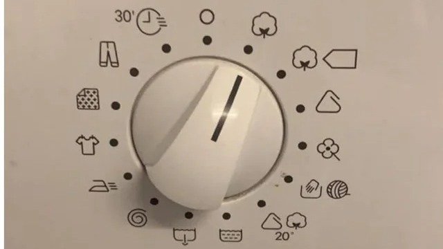
“Only a matter of time before I pass my washing machine operator exam.”

My washing machine has maybe a quarter of the settings shown here and I still find it confusing, so my heart goes out to the person who has to figure out this gobbledygook every time they need to wash their stuff.
