


I’m actually convinced that making a really bad design takes almost as much talent as making a really good one. I mean, some bad designs out there feel too bad to even be accidents .
Like the ones in this list. I’m not saying they were intentionally bad, but these kinds of poor skills could almost be marketed.
“Just make the cat look natural.”

I can tell you right now that somebody made this badly on purpose. Because it’s so bad, it almost makes you want to go out and buy this thing for your own cat.
“Spider-Man in a Spider Car.”

You know how Batman has his Batmobile? Well it looks like Spider-Man has his… Spideymobile? Uh… yeah.
I’m not even going to think about the fact that he doesn’t have eyes on that mask.
“SpongeBob pinata.”

This looks like what happens when SpongeBob has one too many chocolate milkshakes. It also happens to look like something straight out of one of my nightmares. I really hope someone beats it with a stick at some point.
“Are the construction workers playing tic tac toe or something?”

This looks like the construction crew had no idea where the wires were coming out and just kind of… cut holes everywhere. I feel like you definitely have to try to mess up this badly.
“It said push on the other side too, at least one side was correct.”

I guess they had two push handles and couldn’t be bothered to fix it? I’m not gonna lie, this is more annoying than anything else.
“Let’s emboss our logo onto the makeup pad on both sides so when our customers use it, the logo perfectly tears away.”

Something tells me whoever decided on the design for these cotton pads didn’t watch Squid Game , because, well, you know.
“This bathroom in my local shopping mall (The hand dryer at the end is the only working one).”

I think this restroom could’ve benefited from having one less stall. Because, like, this is just hilariously bad. So utterly ridiculous.
“Found at the thrift store… 4 separate languages.”

I have a theory that people go out of their way to make clocks that might look kind of cool, but aren’t meant to actually tell time. This would totally be one of them.
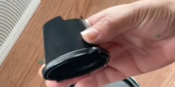
“Pot lid is like a bath toy bc it holds old nasty swamp water from the dishwasher under the handle. The only way to get the water out is a Philips head screwdriver.”

Oh man, that’s kind of gross. And definitely not well thought out at all.
“My wife bought me a beard straightener. It has a setting that turns your face into an ice cube 0°F (-18°C).”

Okay, but like, why? Why does anyone need to straighten their bear hair at temperatures below the freezing point of water?
“I love Laga Dyga!”

I feel a little bit embarrassed at how long it took me to realize that this sign is supposed to say Lady Gaga. I straight up thought it was the name of some European pop star for a second there.
“I think that pole is crucial to the store’s infrastructure.”

I feel like this is one of those things where people aren’t going to fix it for fear of actually making things worse. If it ain’t broke, I guess…
Someone was having fun with the word placement.

But just because they had fun, doesn’t mean they did a good job with it. Unless the point was to confuse anyone who tried to read the sign. In which case, they did a good job!
“Seems like a good idea having two guys pissing beside me while I wash my hands.”

I swear, every single public bathroom was designed by someone who just picked places to stick urinals and stalls at random. Like, what even is this!?
“Pink carpet in a bathroom.”

Carpeted bathrooms should be outlawed, to be honest. I can’t believe there was a time when this was a style .
And this one not only has carpet, but it’s an ugly shade of pink, too!
RELATED STORIES


Is it mold? Is it dirt? Is it… the design?

Spoiler alert: it’s the design. I personally can’t believe this was allowed to hit the shelves. But at the same time, I feel like we shouldn’t be that surprised at this point.
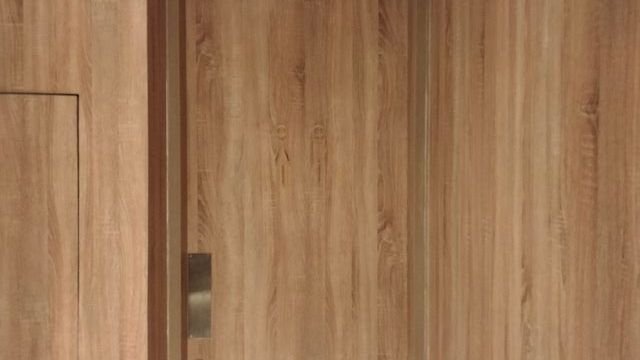
“Toilet sign at a hotel.”

I mean, the wood paneling all over the walls and door is pretty bad to begin with. But the way the bathroom sign blends in with the door is especially bad. No way this was an accident.
“The glitter of this hourglass sticks to the glass, making it almost impossible to see through at times. The glitter also gets stuck quite frequently.”

A sparkly hourglass seems awesome in theory. But this is just dumb. Like, glitter? Really?
“Pillars on the side of an apartment building.”

It almost feels like this was supposed to be the entrance to the building and they just… never moved the pillars. So instead, they just let the building look dumb. Cool.
“This driveway and 2 car garage.”

The driveway itself is so skinny, too. It’s like somebody planned this to be the ugliest, most pointless walkup to a house ever. Here’s hoping the homeowners don’t have more than one car.
