


You know, there are some designs out there that make such little sense, you can’t help but think the designers just didn’t try. Like, they very clearly weren’t thought out very well.
I wouldn’t blame any of the people who designed the things in these pictures if they came out and said they’d given up. In fact, I’d probably be a bit more impressed with them.
“Why do they put sick emojis on the drinks they sell?”

You would think that, for a place that sells drinks, they wouldn’t want to put any kind of packaging on them that would make them seem unappetizing. It makes it look like you’re going to get sick if you drink these. Not good.
“Ggldsmith gestates.”

I like that there’s already a G there, but for some reason the person who designed this sign made the O another G, essentially making it spell “Ggoldsmith.” And the way the second G and the NI sit next to the word “estates” really makes it look more like “GestatesNI.” Very genius.
This really weird train seat on a carousel.

I’m gonna be honest here, carousel seats are kind of creepy in general. Like, there’s something kind of off about the horses.
But this train. Somebody made this super terrifying, but not even in a fun, Halloween kind of way. It’s just ugly. And kind of low effort.
RELATED STORIES


According to this valve, you turn the same way to open and close.

The fact that the arrows for opening and closing this valve are going the same way is nothing but confusing. You’ll really have no idea which way is which unless you sit around and fiddle with it for a while. And even then, you’ll probably end up forgetting.
The way this ad is edited makes no sense.

Not only is the model in the picture posing in a really awkward way, but the editing is just so off. Like, everything seems overly processed, which doesn’t really fit with the tone for a life insurance advertisement. Like, why does this even exist?
An attempt was made.

Why does this look like something someone would make when they were trying way too hard to appeal to kids? Because it’s pretty ugly, and the lack of vowels (except for the first E and the last I) is just really awkward. This could’ve looked way better with some more effort.
“These ATMs are all different sizes and heights.”

I hate the way that this is essentially three different ATMs. The one on the right has a totally different interface, and the one on the left is wider than the one in the middle. And the fact that none of them are on the wall at the same height is just so annoying.
“This children’s book used a picture of Horseshoe Bend for the Grand Canyon.”

Even if you aren’t an expert on geography, you’re bound to know what the Grand Canyon looks like. It’s kind of, you know, one of the most well-known natural landmarks in the country. But some people can’t do basic research I guess…
Okay, what did they do to this cake?

The cake almost looks good. The only problem is the fact that they’re making that slice look like it came from a completely uncut cake. That’s just too confusing.
They really managed to turn such a simple design into something incredibly weird, didn’t they?
This bent pipe.

I honestly have no idea what’s going on here. The pipe is somehow bent at a perfect 90 degree angle, which means it probably won’t be able to pass any water. So… what was even the point of installing it like this? It’s an accident waiting to happen.
The placement of this hand dryer is really bad.

I think it’s pretty common knowledge that hand dryers blow water off people’s hands. Like, that’s just how they work.
So by that logic, you’d probably know not to install them above something metal, right? No? Well, don’t say I didn’t warn you.
There are four seasons: winter, spring, summer, and *foll*.

I hate when people use objects in place of letters, but the object doesn’t match the letter it’s replacing. It throws the whole word off, because all of a sudden you have something there that looks like a different letter. It’s just really irritating.
The packaging for these doorstops is kind of questionable…

I’m sure the doorstops are perfectly normal. But the way they’ve been packaged with the phrase “cook & eat” is… well, not. Like, how are we supposed to take this? What do they want us to do with these doorstops?
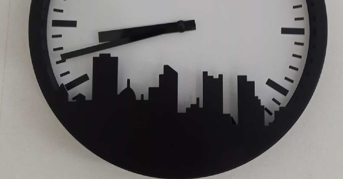
This clock that’s fine, unless you actually wanted it to tell time.

Yeah, don’t expect to get much out of a clock like this. Anything between 4 and 8 is pretty much unreadable, which means those minutes will be too.
This could’ve worked if the skyline design was in any color other than black.
“Chemistry book in Sri Lanka, Jesse teaches chemistry!”

How much do you want to bet the people who put this textbook together just googled images of someone doing “lab experiments?” Because we all know that Jesse Pinkman wasn’t doing the kind of chemistry a school can teach kids (unless they want to go to jail).
But the real question is: can you actually wear these?

I’m pretty sure these are cups that look like shoes, and not shoes that look like cups. Does that make them any better? No, not really.
It looks like this was an attempt at something fun, but it just didn’t work out all that well.
“You need at least $200 to get your watch band size.”

I guess watches are for rich people only? Even then, who actually has 2 $100 bills around that they can use to measure their band size?
You know what would’ve been an easier way to measure? Using a ruler.
This urinal that’s been installed right next to a mirrored wall.

What really gets me about this setup is the way there’s a little privacy divider between the urinals. Who thought the mirrors were a good idea, then? It kind of counteracts the whole point of the dividers. And honestly, it’s a little much anyway.
“We stayed in room 204…on the 4th floor.”

It almost looks like they started putting the room numbers in some strange order, but then just kind of gave up. I think the funniest thing is the fact that they could’ve just changed the numbers. They didn’t have to do this. And yet they did.
“Which way is gate 5?”

So, which way do you go to get to gate 5? For that matter, how do you get to gate 6? Why would they make this so confusing?
Then again, this is an airport, and those places only seem to exist to be confusing in the first place.

