


Nowadays we are literally surrounded by advertisements. They’re everywhere: from TV to subway stations to bus shelters — you can’t avoid them. So you’d think that ad execs would pretty much be able to nail their message on the head, right?
It turns out some of them are sleeping on the job because these ads have failed miserably and there’s no point in them being out there at all…except maybe just to make us laugh.
1. This Message

If anybody can decipher what this is trying to say, be my guest. I can’t for the life of me figure it out. What am I missing?
2. This Pain Relief Advertisement

Be careful, if you stare at this ad long enough you might start seeing things. And, they’re not all that good. Ha, ha, ha.
RELATED STORIES


3. This Timely Online Ad

I guess the advertising church set up a keyword to show their ad. Unfortunately, they should have omitted cases like these. Fire that ad manager.
4. This Shower Ad

If the only way to use this shower is to break my neck, then I respectfully decline this offer. Thank you very much, indeed.
5. This Confusing Message

I think they’re trying to say that this plastic bottle was made using recyclable materials that otherwise would end up in our oceans? Wrong wording, though.
6. This *Suits* TV Ad

I know they’re trying to say Suits in this ad but the “New Episodes” bar on it gives it a whole different name. LOL!
7. This Social Distancing Sign

Wouldn’t it make more sense to make this sign lie horizontally so people can really measure what six feet apart would look like? Come on!
8. This Terrible Ad Placement

Yes, because a man plunging to his death is really a perfect solution for marital separation. Who thought this placement was totally okay here?
9. This Unfortunate Coincidence

OMG, are you seeing what I’m seeing? Is this just an unfortunate coincidence or something else? So wrong.
10. This Awkward Invitation

Um, no thanks. I think I’ll pass. This church has some rather unfortunate ad placement for its bible camp right underneath a cemetery. Wow.
11. This Awkward Pizzeria Sign

Why would anybody write this Pizzeria sign in such a way? It’s like reading it backwards. What is the point of this? Anyone?
12. This Mistaken Identity

I dunno about you, but if I hire somebody to do raccoon removal around my property, I want them to know what a raccoon looks like.
13. This Double Feature

Here’s a perfect example of two ads that definitely shouldn’t appear together. I dunno if anybody noticed this or what. This is a whole lotta wrong.
14. These Ghosts

Newsflash: Next time you Photoshop people into an advertisement just remember to add their limbs too, okay? Somebody is snoozing on the job here.
15. This Juice Carton

It shouldn’t be that difficult to open a juice carton. But in this example, the arrows on the carton actually contradict the arrows on the cap.
16. This Relevant Ad

If I had a fear of ducks and was reading about my condition, I would be totally freaked out by this ad. Ahhhh!
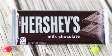
17. This Font Color Choice

Yes, let’s put a black font on a package that’s already pretty dark in color so people can strain their eyes trying to read it. Who came up with this?
18. This Math

Somebody clearly failed math in school because this advertisement for bagels just doesn’t add up. There is more than one of each flavor. LOL! Duh!
19. This Yummy Mask

How about this for appetizing? I bet reading this article is really going to get you in the mood to put on this chocolate mask. Eww.
20. This Unfortunate Ad Placement

I dunno about you, but I don’t really want to think about a plane going down right before I board one. Is it just me?
21. When You See It, It’s Terrifying

Everything looks normal about this ad until you look down. Did you notice her feet? Either that is some bad photoshop work or she is really, really flexible.
There are some fantastic advertisements out there that really get straight to the point and make us want to get the product.
These, on the other hand, do the opposite!

