


I have to admit, there’s something really addicting about looking at bad designs . Some are just so bad, they’re (almost) good. Not quite, though.
These designs honestly have me losing my mind. Someone out there really thought any of these were good enough to put on shelves, or to set loose on an unsuspecting public. It doesn’t get any funnier than this.
RELATED STORIES


What came first, the crosswalk or the shrubbery?

I mean, it almost doesn’t matter which came first. The bottom line is, somebody messed up. And clearly, they didn’t care, or else they wouldn’t have done that.
You squeezed what into what?

This is so hilariously bad! The fact that somebody really thought putting pale yellow on a white background was a good idea? Wild.
“These are stairs…”

I’m sure for most people, you could walk down those stairs just fine. For me, I’d absolutely be clinging onto the railing for dear life because I’d 100% trip on a step at least three separate times.
“This is what happens when your Fiverr designer only has MS Paint.”

Because it isn’t hard enough to buy things online without having actually seeing them in person, right? In all seriousness, this lack of care is one of the worst parts about fast fashion trends.
“Dublin Airport didn’t think this through…”

Yeah, they definitely didn’t. You’re telling me that they couldn’t have at least made it so those guard rails actually, like, guard the wall? Terrible, but in the most hilarious way.
“My friend has found this elevator. They needed to go to the 8th floor. Actually, pushed the 10th floor button and it went to the 9th floor, and the 7th floor button goes to the 7th floor…”

Also according to OP, there is no floor 10 to begin with. This layout just keeps getting worse and worse.
It lets a lot of light in, at least…

This is probably the worst way to design a house. Believe it or not, there is such thing as too many windows. All I can think about is how much of a workout it must be to open all those curtains every day.
“If you need a way to make it easier to lose your tools working in the yard…”

I take it that, in somebody’s attempt to make a yard/garden tool more “masculine,” they forgot what the point of camouflage was in the first place. If you drop those in the yard, good luck finding them.
Simplicity, but make it as complicated as possible.

I need to know if this was some kind of ironic statement, or if it was meant in the most genuine way possible. Bad design or not, I kind of want one of these for my house.
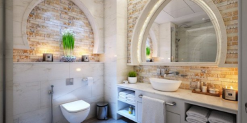
“This accessible toilet at a healthcare facility.”

Some people need to take a good, hard look at the word “accessibility” in the dictionary, and then try designing bathrooms again. This one really ain’t it.
“This sign on the wall of a restaurant I went to last night.”

See, this is less a bad design, and more an infuriating one. Even if it was meant to be ironic, it would still really tick me off. That fork could’ve easily been a spoon!
Ah yes, because…

I truly don’t understand what’s going on here. Is it a set of stairs that was supposed to have a ramp but the post got in the way? Did they put the ramp in because of the post? In any case, this is an absurdly stupid design.
Those mini-stairs on the side are killing me right now.
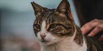
When you don’t have cats, but you want everyone to think you have cats.

Reddit user prgutiarman called these, “The Cat Butt collection,” and I think that kind of sums up what’s wrong with the design on these sheets.
“This is a poster by a design school.”

This definitely wasn’t thought out very well. I get they’re trying to go with “be yourself” and “be who you choose to be,” but all together this doesn’t make any sense.
“Saw this at the mall.”

I, for one, am genuinely terrified of the Angry Bird horse plushie. This is definitely the kind of weird, vaguely threatening thing you’d find in a mall, though.
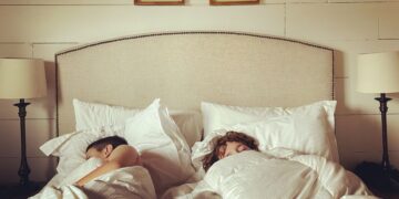
“My hotel has a window to the bathroom, so I can hear every little noise my roommates make in the morning, also the bright light shines through.”

See, I get why somebody would put a window between two interior walls (to let light in). But that doesn’t mean you should always put up indoor windows. Sometimes, it makes things worse.
“The placement of this ‘Press to exit’ button in my apartment building.”

I think the fact that the exit button’s text is all faded makes this so much worse. I wonder how many people have been accidentally stranded thanks to this placement.
Nothing beats a sign with confusing wordage.

The first time I looked at this, I totally missed the 1. I bet this place has a bunch of confused, angry customers who thought they’d be getting two caramel apples for the price of one.
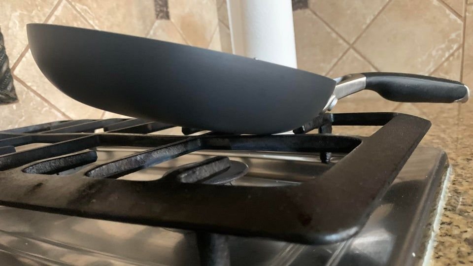
“The handle of this pan is heavier than the actual pan…”

On the plus side, if you stick enough food in that thing, it’ll balance itself out eventually. Still, I feel like this is a pretty dangerous design.
“This toilet at my sister’s house.”

Having extra bathrooms is a great way to increase the value of your house. The only caveat is, they need to be functional. I’m, like, 99% sure this toilet is violating at least a dozen codes.