I dabbled in design in college. Nothing major, but a couple of classes on things like logo design and good user interfaces. But even if I didn’t have any background in such things, I — and anyone else with a bit of common sense — can tell that these designs just plain suck.
1. Like, why did they even bother making the sign like this?

Look at all the bare wall to the right of it! It’s not like the sign is new and they were hurting for a place to put it. It’s so very, very dumb.
2. Thankfully, this is not a pair of bathrooms with a glass wall between them.

Unfortunately, it is a bathroom surrounded by very reflective mirrors. So while you won’t have to stare awkwardly at a stranger, you still have to do so with yourself.
3. Speaking of terrible bathrooms, this seems unsanitary.

Though I suppose it might be convenient to be able to wash your hands without taking a step away from the urinal. The lack of any privacy probably negates that small upside, though.
4. She seems to be really enjoying that spoon, doesn’t she?

It’s not like she’s actually eating something. I get that eating might make the photo shoot messy, but at the very least they could have cut into the food on her plate to make it look like she’s taken some.
5. This package clearly doesn’t contain a wireless mouse.

I mean, maybe the webcam is wireless, so that part isn’t a lie. Still, that would be a very inconvenient thing to try to use as a mouse.
6. If I was looking to buy a house, one with this happening on a ceiling would be immediately out of the running.

The house could be otherwise perfect, but I simply could not stare at this every day.
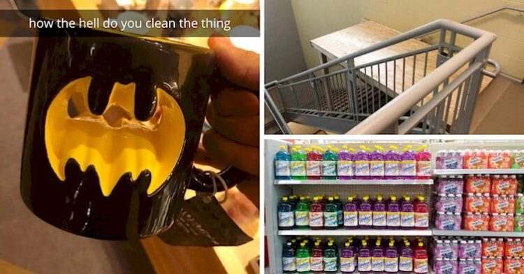
7. Oh cool, this Batman mug has a 3D effect! Wait…

Even though you can technically drink from it, that’s a lot of forfeited coffee per serving, and how the heck do you clean the thing?
8. The manufacturers of this key chain apparently can’t tell Mario and Luigi apart.

That, or they were trying to get around Nintendo’s trademarks in order to sell some crappy knockoff merchandise.
9. I hate to tell you, but that’s not a pug.

Rather, it is a bulldog wearing sunglasses. Now, it’s an easy mistake to make because all doggos look the same when they wear sunglasses.
10. Well, this is one way to ensure that everyone’s hands are clean.

It is also a good way to ensure a ton of hand sanitizer is wasted and no one turns off the light to save energy.
11. I hope this building never has an emergency that requires these stairs.

I would like to think that this upper floor isn’t used, but it can clearly be accessed well enough to take this pic.
12. I love architectural details like ceiling medallions, and this one is particularly beautiful.

So, why the hell wasn’t the light installed in the medallion where it belongs? The exposed, dangling wire just adds insult to injury.
13. Microwaves are meant for swift cooking, and so a lot of things only take a couple of minutes to heat.

So, of course the smallest unit of time on this dial is five minutes. Anything less, and you’re stuck guessing.
14. The model looks aghast at what’s been done to her face.

There are so many examples of this kind of fail that it’s hard to choose, but something about how this image is clearly supposed to be sexy just makes it for me.
15. In case you didn’t know, Fabuloso is a house cleaning product.

The product design is bad enough, but Walmart just compounded it by stocking them right next to the actual juice.
16. This is too meta for words.

It’s a poorly designed sign about design elements. I’m not sure what’s worse: the garish choices of fonts and colors on a marble background, or the fact that it looks like it was made in MS Paint.
17. Lots of reusable water bottles include measurements these days.

It’s an easy way to keep track of your water intake throughout the day, right? However, that only works when you can actually see the water level inside the bottle…
18. I really likl this rug, don’t you?

Admittedly, this might actually be the best representation of the state of my brain before coffee. I can’t spell until I’m caffeinated, either.
19. “This sign at the international school I go to.” —InboundBark49

Oh no, this isn’t confusing at all! Ugh.
Native English speakers can barely read it right the first time. Don’t do this to international students.
20. Um…why is this bike lane a thing?

It’s such a waste of time and paint to make it like this. It’s the opposite of lazy workmanship! Just paint the bike lane on the other side of the walkway.
21. When you open this emergency closet, you may or may not find what you need.

Is there a ladder or a hammer inside? I guess you’ll just have to cross your fingers and hope the 50/50 chance goes your way.
22. I’ve seen a lot of bathrooms with questionable privacy, but this is ridiculous.

What toilet needs an audience?! Also, that toilet paper roll seems a bit too far away for my comfort.
23. Dear ambulance companies: don’t use an EKG motif.

You think it would fit, but no matter what you do, it’s going to look like it’s flatlining. Maybe just avoid that mental image.
24. That has to hurt…

Nothing like cupping your hands around a gas flame to really make you feel alive, huh? My palms feel hot just looking at this. Ow ow.


