


Who doesn’t love a good optical illusion ?
The idea that something that looks so simple can warp our supposedly advanced brains is just flabbergasting.
RELATED STORIES


And in the latest example, engineering professor has taken time out of his busy schedule to blow everybody’s minds .
This might sound hyperbolic, but Professor David G. Novick is showing off some optical illusions that are pretty much impossible to get your head around.
Do you like optical illusions?

On one hand, it’s fun to give your brain a workout and see things in unusual perspectives. On the other hand, it’s a bit disconcerting to know that an image can mess with your perception so much.
David Novick is a master of this kind of stuff.

While Novick’s work at the University of Texas at El Paso is focused on leadership and entrepreneurship education, he has a soft spot for optical illusions. His favorite kind? Munker illusions.
What’s a Munker illusion?
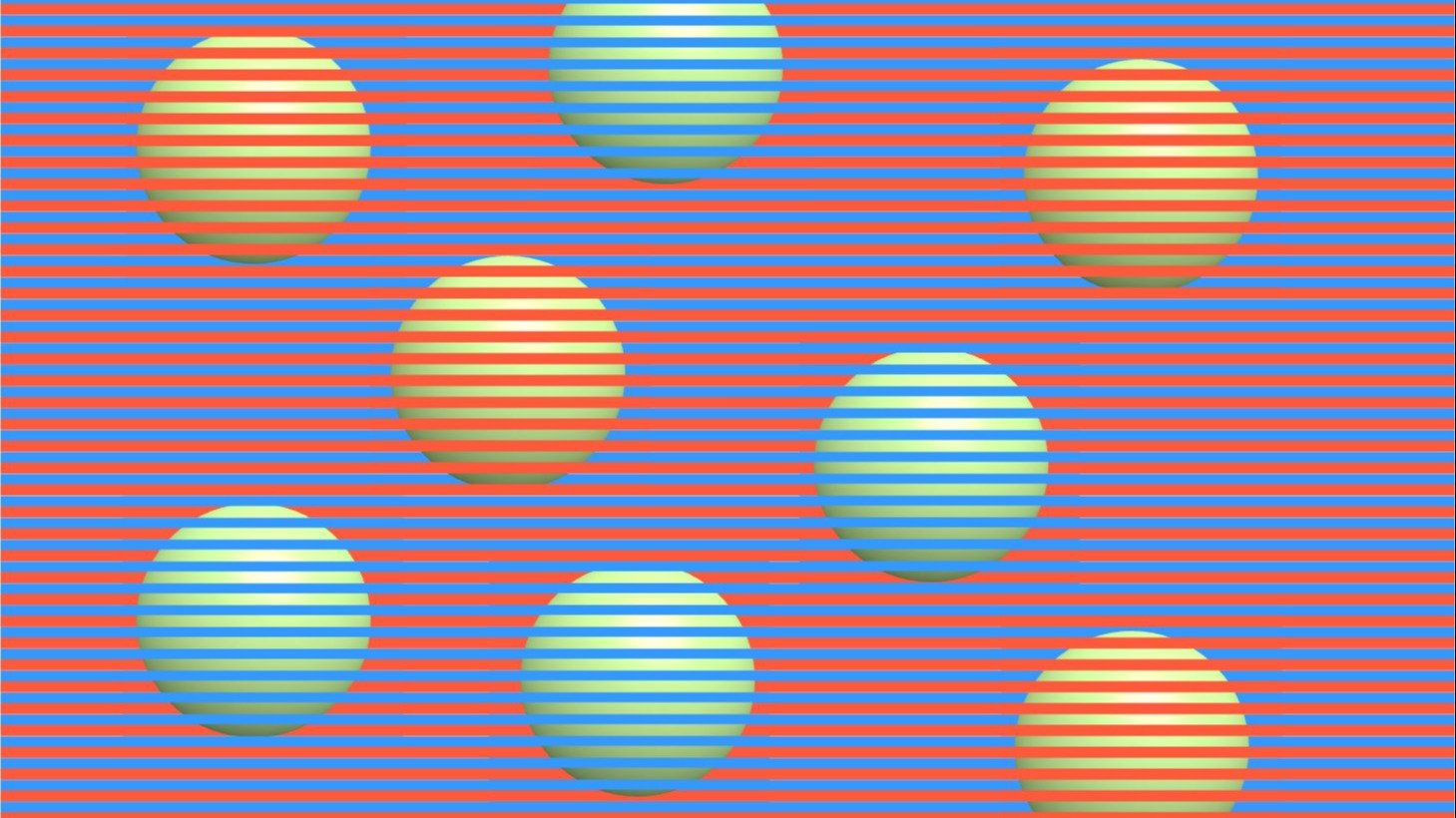
Novick gives a few links to Munker illusions that he’s compiled, but the long and short of it is that these illusions appear as two different colors, even though they’re actually the same color.
That’s right. Those orange and blue spheres are actually all the same color.
But…how?

The horizontal colored grid uses colors that throw off our perception of the colors within the shapes we’re focusing on. You can see that both of these images have fuchsia lines. But things get confusing when you focus on the circles.
Perception is influenced by surroundings.

When you blur your eyes, focus and unfocus, you can kinda-sorta see that some of these images show the same colors. But even after knowing how these illusions work, it’s still tough to convince your brain.
This gif shows it in better detail.

You can see here that both circles — the light orangey-yellow one and the neon yellow one — are actually the same shade.
It works on photos, too.

Focus on just the horizontal bars that show the photograph. You can see that the image of the cat is the same color. There are plenty more examples on Novick’s website.
Here’s a similar illusion.

Here, we see a photo that appears to have a few different colors. In reality, it’s composed of three RGB colors: 88, 96 and 112. The red-looking areas here are actually more of a blueish-gray.
Now it’s just getting ridiculous.

Here’s a design that would look great on an ’80s t-shirt. Believe it or not, the narrow vertical zig-zags, the ones that look fuchsia and violet, are all the same color.
That’s enough for now.

We could go on, but personally, my mind has been blown enough for one day. If you want to continue down this path, be sure to check out Novick’s Dropbox and website for many more examples.

We want to hear from YOU so we can serve you better. Complete this quick survey and you will be entered to win a grand prize of $2,000, or a chance to win one of 10 Diply prize-packs!
