


If you’re a fan of fast food, you’re going to really enjoy what I’m about to share with you about two very famous joints. I’m talking about Subway and McDonald’s . Most of us have eaten at either or both of them, huh?
But did you know that there are hidden meanings behind their logos? Oh, yeah. That’s right. So listen up, I’m going to share that little bit of history with you. I promise it’s pretty fascinating. Check it out.


Okay, so let’s start with McDonald’s

The company’s golden arches are recognizable around the world. Am I right? No matter where you are, you can’t miss them, ha, ha. But what I’m going to share with you about those arches might surprise you. Heck, it might even shock you a bit, too.
What do the golden arches make you think of, huh?

Would it surprise you if I said, motherly love? Well, apparently, that’s what Louis Cheskin told McDonald’s executives back when they first designed the arches. McDonald’s hired this design consultant and psychologist, and he clearly had an insight into people’s minds.
But here’s what shocking about it all.

Cheskin convinced McDonald’s executives to design the golden arches so they actually looked like breasts and would — get this — help boost their sales. Um, what? Oh, yeah. He even called the golden arches “mother McDonald’s breasts.” Okay, that’s a little creepy, right?
Well, as it turns out he was on to something.

He literally claimed they provided some type of Freudian significance in the subconscious mind of customers. And since it’s been 57-years, McDonald’s golden arches are still the most recognizable fast-food symbols, and people are constantly flocking to eat at the restaurant. Hmm, how fascinating is that?
So, let’s move on to Subway

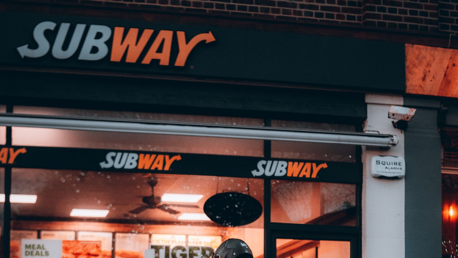
There’s no way you haven’t noticed the two arrows in Subway’s logo, huh? I mean, they’re pretty hard to miss. So what’s the story behind them? Well, let’s dig deeper into it. Shall we? Let’s go.
Let’s look at this logo a little closer.

The Subway signage features white and yellow lettering, with arrows coming off the “S” and the “Y.” Why is that? As it turns out, it’s not just aesthetics. Oh, no! There’s more to that than that.
Check this out.

The arrows represent the entering and exiting of a subway car. Aha! That’s starting to make more sense to me now. So what this logo symbolizes is the speedy service that Subway employees offer to their customers.
Nice, eh?

That’s pretty clever. Isn’t it? I love when companies come up with cool stuff like that. I mean, after all, Subway sandwiches are delicious, the service is quick, and there are many locations around just like the subway. Well, except for the tasty part, ha, ha.
Let me ask you: did you know about these secrets of fast food logos?

Or were you just as surprised by these facts as I was? I definitely didn’t know this about McDonald’s. Looking at those golden arches will never going to be the same, right?


