No matter what you find yourself doing in life, there’s a very good chance that somebody out there is trying to keep track of it.
I don’t mean to suggest that somebody is specifically spying on you , but rather gauging the small way in which you contribute to overall behavioral trends and other data that becomes useful for governments, advertisers, and other organizations.
We all have a data footprint of some kind and it can be used to inform anything from vaccine rollouts to education and employment programs to new TV shows somebody thinks we might like. And for that data to come across, it must be presented in a clear and eye-catching way.
That data presentation is exactly what the members of Reddit’s r/dataisbeautiful community have made into their hobby and what they use their skills to tell us can be pretty surprising.
Although many of the charts we see in this community involve identifying trends from large datasets, some of them are much more personal.

As one user expressed , their hospitalization following a mental health crisis back in 2019 compelled them to seek treatment.
Their legend does a lot to illustrate how the days in the year that followed went for them and as they put it, “This is what a year of therapy and proper medication can do. Don’t give up.”
But while some of the charts we’ll see on r/dataisbeautiful are similarly serious, others can lay out quirkier information that we never considered.

For instance, not only does this one tell us how many nations in the world have no roller coasters to speak of, but also how many have at least one that measures at over 200 feet tall.
Now I’m kind of curious to see how much that second number shrinks when you put countries with coasters over 300-foot tall in their own category.
This chart features the interesting idea of determining the relationship between how many lines a given _The Office_ character gets in an episode and how well that episode does on IMDb.

That said, this seems to have more to do with the overall popularity of the episode each character gets to speak in rather than their specific contribution to that popularity.
Still, it’s likely not a coincidence that the least popular episodes had a lot of screen time devoted to the show’s least popular characters — or in Andy’s case, the least popular decisions made with that character.
Apparently, many Redditors are convinced that the bulk of the memes that appear on Instagram are lifted directly from their communities.

But after years of hearing this, a user named AwesomeSonic567 became curious as to whether that was actually true and researched the matter until they had what they needed to make this chart.
It’s worth noting that the “other” section was so widely populated by memes found on the website iFunny.co that AwesomeSonic567 wished they gave the site its own section.
And if you’re wondering what it means to have a meme with a “disputed source,” this section refers to memes that appeared on Instagram at roughly the same time as on another platform.
This chart takes on the ambitious task of tracking America’s voter turnout since shortly after the nation was founded.

Not only does this graph illustrate how staggering the voter turnout was for the 2020 election but it also shows what an electoral boom the United States had during the 19th century.
According to the National Endowment for the Humanities , historians are split between whether this because of a “highly motivated citizenry” or simply elevated rates of voter fraud enabled by “less than diligent” census takers at the time.
In either case, it’s clear that voter turnout rates started to decline once the “secret ballot” reforms that still affect how we vote today were introduced.
As I’ve said, some of the charts in this community are personal and occasionally, we can get one that’s more on the humorous side.

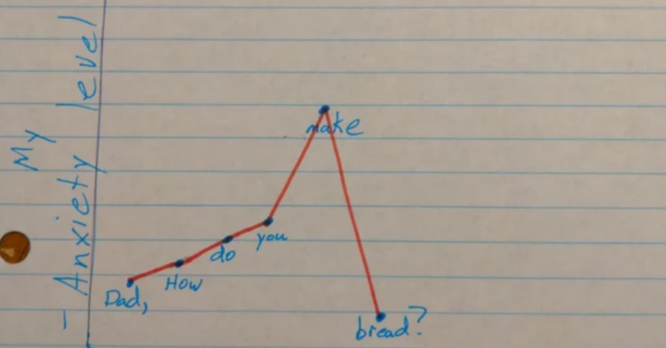
For instance, one dad clearly thought he had a major project on his hands before his worries were deflated by his daughter’s curiosity about baking.
Of course, your mileage may vary on this one since I can’t actually say I’ve baked bread before. So unless she was generally asking me how one does that and didn’t actually expect me to, let’s just say that trend would increase.
According to this person’s chart, the animals we associate with being nature’s deadliest hunters are actually some of its underachievers.

After all, just because an animal wouldn’t be as good at eating us as those on the lower end of this list, that doesn’t make the way they hunt other creatures any less efficient.
And in case you’re wondering, the Smithsonian Magazine confirmed that the African black-footed cat is small even by the standards of domestic cats.
But its speed, keen senses, and varied hunting techniques make it a fearsome predator for insects and rodents.
Sometimes, the data we examine can be staggering without necessarily being a surprise.

For instance, it’s pretty obvious why this chart presenting the numbers of passengers who passed through TSA checkpoints between 2019 and 2021 showed such a drop last year.
However, the fact that this “throughput” rate is only recently approaching numbers that would’ve been at their lowest pre-pandemic illustrates just how intensely air travel plummeted in 2020.
While it may not be surprising to learn that McDonald’s still leads the fast food industry in sales, there are a lot of fascinating details in the data that determines this.

Most striking — at least to me — are the sheer volume of Subway locations compared to every other chain accounted for here.
As The New York Times reported , this saturation of the market was the intentional result of making Subway franchises easier and less expensive to open than others. However, this backfired when the Jared Fogle scandal and increased competition in the sub market turned this ubiquity into a liability rather than an asset.
Alongside this photo, the uploader proudly proclaimed “I finished my year long temperature blanket!”

However, one has to uncover a particular comment they made to figure out what we’re supposed to glean from this blanket.
At they explained, the left side expresses the daily high temperatures throughout the year, while the right side shows the low temperature of each given day.
Meanwhile, the deeper tones of “warm” and “cool” colors show more extreme temperatures in either direction. As for that curve running through the center? That marks the separation between the amount of daylight and nighttime that a given time of year had.
It’s very detailed for a chart with no actual numbers.


