Making a good design isn’t always as easy as it seems. You have to make sure it looks nice and that it functions the way it’s supposed to. Seems like a no-brainer, right?
Well, based off the designs in this list, it clearly isn’t. Sure, making a good design can be tough , but it shouldn’t be as tough as these pictures make it seem.
“Any spillage lands right on the handle.”

This is a pretty dumb design. When you want to make something look cooler than it normally does, you should also remember that it still has to function well. This mug may look kind of cool, but it’s super impractical.
“This Garbage bin actually leads to another bathroom stall.”

I can’t believe somebody thought of this and didn’t see a problem with it. Like, whatever happened to privacy when using the toilet? At this rate, you might as well remove the stall doors while you’re at it.
“Why do most laptop companies place the headphone jack on the right, when most headsets have the wire on the left?”

“Also, most people who use a mouse (even left-handed people) with their right hand, making movement restricted. Why is THIS the norm?!”
They have a point. Why is it that we’ve let this design be the norm for so long?
“I see this at school everyday.”

They couldn’t have at least tried to make that look uniform? It’s not even the fact that the light is diagonal in comparison to the ceiling tiles. It’s the fact that they made it look so uneven!
“Their name is Lavina.”

I get that the letter V is essentially just the letter A but simplified and upside down. I’m not sure if the person who made this sign got that, though, since they made that V look like an A.
And now all they’re left with is an L.
“I CDs.”

Luckily, it follows the “I heart X” format well enough that you can still tell what it’s supposed to say. The problem here is the fact that they used a round disk in place of a heart, and that makes me really angry for some reason.
“Why are there ears on its butt?”

I guess they really wanted to drive the point home that this is a bunny basket. But… they could’ve put the ears on the other end at the very least.
With spring around the corner, we’re probably going to see a lot of confusing Easter Bunny-themed designs.
“Sidewalk everywhere but the door.”

I’m not gonna lie, this one made me laugh, just because of how ridiculous it is. Like, did they forget to put a slab there? Did they start taking them all out and gave up after a single slab? Makes no damn sense.
“My husband was given this abomination at work.”

Don’t get me wrong, the design on this hoodie is horrible. But at the same time… would I wear it? Probably. It’s one of those things that are so ridiculously bad, you can’t help but love them.
“Hoodie” in the corner is making me chuckle.
I wouldn’t wear this one, though.

This Undertale sweatshirt is right about one thing: I am having a bad time. And it’s all because AliExpress couldn’t bother to at least make it look like the text was actually on the hoodie.
“Yeah, thanks for showing only the people walking up.”

Sure, you’ll see those signs easily while you walk up. But you won’t see them at all from the top, which means plenty of people probably walk down those stairs, too.
It looks like somebody didn’t think about this all the way through.
“Thanks for clarifying the difference between summer and winter hours.”

One of humanity’s worst inventions is daylight saving time, which usually starts around March/April, and ends around October/November.
I’m betting this sign was trying to accommodate for the time change. But then they forgot that it doesn’t actually make a difference in the end, and ended up with this nonsense sign.
“The hole on my box of Gobstoppers is smaller than a Gobstopper.”

Looks like those Gobstoppers got Gob-stopped (I honestly couldn’t help myself there).
As much as I love when candy comes in boxes instead of plastic bags, this oversight makes it so hard to actually use the boxes as intended.
“A piggyback [sic] I recently received. It also isn’t level on its base.”

This piggybank was so close to being really nice. But it missed the mark by… well by whatever the distance away from the center the slot is. At least it’ll still probably work.
“The toilet seat in my basement is completely flush (no pun intended) with the bowl, so you have to dig your fingers up under it to lift it.”

I know that the seat cover is probably the cleanest part, but the idea of having to dig your fingers in any part of a toilet is giving me anxiety. I’d probably just replace the seat.
“It’s supposed to be a clock.”

I love when clocks look really cool. But the whole point of a clock is to be able to tell the time. So while this makes for a pretty interesting piece of art, it also makes for a really terrible clock.
“Technology information dept.”

I get what they were trying to do, but this is still a massive L. The way the word “Department” descends from the N in “Technology” makes no sense.
Actually, I don’t think there was a way to do this that would make sense.
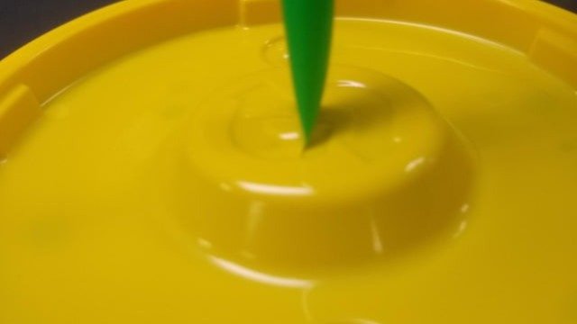
“Subway’s new lid closes the straw.”

We can argue about plastic straw bans all we want, but there’s a bigger enemy we have to deal with. And that enemy is this Subway cup lid. A true abomination.
“The opportunity was right there…”

I don’t know what makes me angrier, the fact that they could’ve used the same R for both words, or the fact that the vertical “sugar” isn’t even centered with the horizontal R.
“How I can see into the next stall through the TP holder.”

This is probably worse than the bathroom stall where you could see into the next one through the garbage. Because at least that one could be close. This one is always open. Yeesh.


