


There’s being lazy , and then there’s downright caring so little, you actually go out of your way to do a bad job. I guess ironically that’s just a sign you care too much.
In any case, whether from carelessness or pure prankster spirit, whoever made these things did so… pretty badly. So badly, it’s kind of impressive . But not really.
RELATED STORIES


“When I find myself in times of trouble, Mother Walgreens comes to me, speaking words of wisdom:”

Ah, the underpaid worker who just isn’t invested enough in their part time job to do something decently strikes again. But who can blame ’em?
Don’t aid…?

Ohhhhh, Dent -aid. I mean, when you look a little closer at the truck, it makes more sense. But at a glance, that’s a pretty lousy logo.
At least it’ll get people’s attention, if that counts for anything…
“This Sign is supposed to be read by 45mph traffic, on the sign is a picture of a smaller sign, which in turn has a picture of a tortoise.”

In other words, the town didn’t have enough of a budget to get it right the first time.
“Letters layout makes me mad.”

Yeah… that is a really frustrating layout for the letters. Especially since “juicy” is a five-letter word… and there are five fingers on a hand…
I feel like whoever did this didn’t think it through. At all.
An accident just waiting to happen.

Once when I was a kid, I set off the emergency alarm in a rec center by touching a defibrillator door. I imagine it would be a lot easier to accidentally set off this alarm.
This just in: everything is actually a reptile.

Last I checked, spiders, scorpions, centipedes, and coyotes weren’t reptiles. Creepy? Yes. Dangerous? Most likely. But still not reptiles.
And I really don’t want to know what kind of reptile an etc. is…
“The entrance is right over here- SIKE!”

It’s like they want you to enter, but also don’t want you to enter. Maybe opening those doors would trip an alarm. Or maybe absolutely nothing will happen no matter what you end up doing.
“I was wondering where the apple juice was! It was in the cookie aisle the whole time.”

I have to say, the layout of this single grocery store aisle is more confusing than anything I’ve ever seen. It doesn’t look like a Walmart, but it feels like one.
“Move needs daily body.”

No matter which order you put those words in, you can’t make a phrase that actually makes sense. I seriously hope there are more words on the other side of the bottle. For my own sanity.
“The longer I look at it, the worse it gets.”

This is probably the dumbest sign I’ve ever seen. So many repeated phrases. And the way the first letter of each one doesn’t even end up spelling anything.
Also, “Enjoy life” being on there 4 times is hilariously menacing.
“Pay extra for a fancy sink and faucet. Support it with shimmed 2×4s.”

I want to say it’s probably more secure than it looks, but you wouldn’t be catching me leaning against that sink if my life depended on it.
“The opaque plastic of this bread bag makes it look like there is a lot of moisture trapped within.”

I just want to know what was going through the designer’s head when they decided that this was the way to go. It looks like that bread’s about to be all soggy and gross.
It’s called art. You wouldn’t get it…

I have to admit, I’m pretty tired right now. I don’t think I have the mental energy to try and figure out what the heck this sign is trying to tell us.
“These lights in my grandma’s house in Idaho. Always looked like this, pretty sure only 3 of them work too.”

Either they wanted that pot light effect without the pot light, or they just installed a new one every time the last one’s lights burned out.
I don’t think they’re saying what they think they’re saying…

Yeah, uh, that definitely isn’t supposed to say what it looks like it says. The weirdest part is, even if you look closely enough at the whole message, it doesn’t even tell you what they’re advocating against.
“They were too lazy to put it just a little bit more to the right and had to do more work in the end.”

This feels like the most classic renovation fail out there. You’d think people would learn to do it right the first time by now.
“They completely blocked the view of the actual ocean with poorly painted glass panels. They did this with all of the dozen or so benches facing the water.”

Because the actual view just wasn’t up to their standards, I guess?
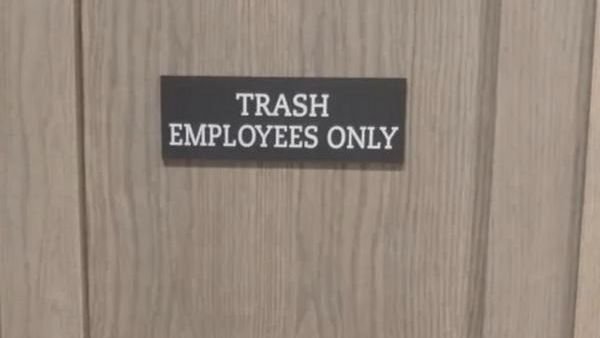
“Trash employees only.’ I wonder if they did this on purpose.”

A part of me wants to say there’s no way this was done on purpose. But then another part of me totally believes that it was.
“Advertised as an ‘invisible chair.'”

There’s… there’s no way that guy is actually sitting on a chair right now. He’s just squatting, and using more energy than he would by just standing. I bet he’s gonna be pretty sore in the morning.
“Officer, I sincerely believed I was only doing 85.”

Not only does this make zero sense, but it’s also super dumb. It really makes me wonder how some people can get away with designing whole user interfaces that don’t work.