


There are some designs out there that are so bad, they’re borderline offensive . They make you wonder how people got away with making them in the first place.
When it comes to the designs in this list, they all almost feel like they were created to be one giant middle finger to the world. So, we’re giving them the bird right back.
RELATED STORIES


“Ah yes, a perfect depiction of me talking on phone.”

The person who made this highly questionable picture needs to learn two words: quality control. Like, geez, the font isn’t even uniform. What the heck happened here?
“Who even thought this was a good idea?”

I was really sitting here for a couple minutes, thinking that sign was supposed to say, “McDorads.” Like, it almost looks like some bootleg McDonald’s they’d have in a video game or something. What a mess.
This shirt that this model is totally wearing right now.

When it comes to Amazon product pages, you can always rely on them to blatantly insult our intelligence. Like, do these sellers really think people are going to think the models are wearing things like this?
“See that beige part on the ground? It’s a brand new bike lane in France!”

Yeah… no. As good as it is to add bike lanes wherever you can… you also need to make sure they’d actually fit there. This is just messy and confusing.
“Danger bench.”

This bench is stressing me out. It’s totally an accident waiting to happen. And the worst part? All they’d have to do is put a railing of some kind in front of it. Then it wouldn’t be nearly as dangerous.
“People should stop making faces on windows.”

I wonder if the people who put that ad on there realized this was going to look ridiculous before they did it and just didn’t care, or didn’t notice until after the ad was stuck on there… and just didn’t care. Either way, they probably didn’t care.
“This toaster toasts the plastic surrounding your breakfast.”

Because there’s no better thing to put on your toast than melted plastic. No but seriously, that’s both gross, and probably cancerous? I wouldn’t be using that toaster. Ever.
This sticker tried so hard to be rude.

It tried, and it failed. Instead of saying, “I love the sound you make when you shut up!!” It looks more like, “I love the sound when you shut make up!!”
Okay, this is downright evil.

It’s like they wanted people to think there were way more cookies in there than there actually were. Why would anyone be so evil and do that?
“It’s not even in front of the pedestrian crossing.”

Oh yeah, it’s not like people need those warning pavers to warn them when the sidewalk ends. Because blind and visually impaired people don’t exist, apparently.
“Got it on my United Airlines flight. The lack of apostrophe is killing me inside.”

This makes me think that the apostrophe button wasn’t working when they were printing the text on this napkin. There’s even a space there. Either that, or quality control once again decided to take a vacation.
“Went to a coworker’s place on a day off; checked the time literally 10 times before realizing…”

Why is it that my first thought was that this was some kind of daylight savings clock? Because, you know, 1 AM happens twice when we switch back to standard time.
But then I realized that would make even less sense than this being some kind of weird error.
“50% off.”

It just takes one letter for a sign to go from normal to vaguely threatening. I wonder if the store owners know that their logo totally doesn’t look like it says “Red Shoes.”
“It was surprising to read on first look.”

Hey, speaking of how a single letter can make something normal look threatening. There’s something really comical about Barbie smiling next to a sign that looks like it says, “Hell.”
“Hgme Sweet Hame.”

This feels like it was made for a very specific sports fan, and also for people who hate reading. It feels like the longer I stare at it, the more brain cells I lose.
“New Construction didn’t seem to plan for porch beam it seems.”

I’m no construction worker, but even I can tell you that there’s no way this is to code. In fact, I probably wouldn’t be going anywhere near that house.
“The design on these lights makes it look cracked.”

I hate lights that look like this. I feel like they were designed by people who hate good taste. They’re just awful!
A swing, but you can’t swing on it.

This was definitely put in place because of safety issues — either somebody got hurt, or they didn’t want to risk anyone getting hurt. But you know what would’ve been better? Removing the swing altogether. Like, what’s the point of having it like that?
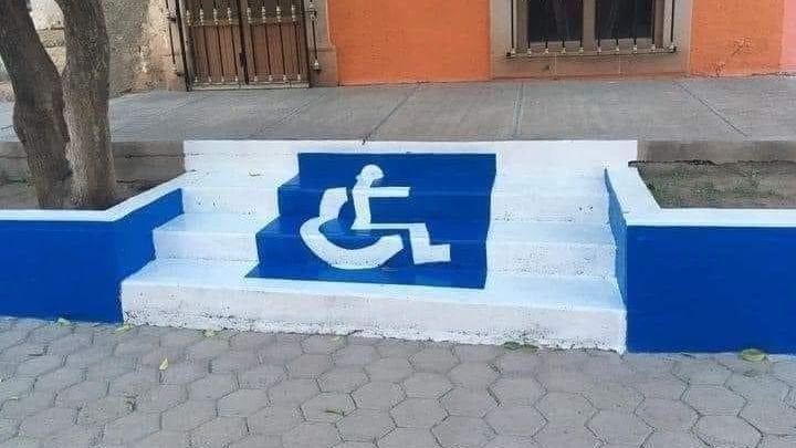
“Wheelchair friendly stairway.”

You don’t need to be a wheelchair user to find this insulting. Like, whoever did this is probably super evil, and just likes watching people get angry.
“Lego printing super dark colors against a black background. I tilted the phone to catch some glare so you could see it at all.”

The best kinds of instructions are the ones you can’t understand at all!
…Not.