


It’s time to de-stigmatize bodies that experience periods and start celebrating them. For far too long, the female body has been shamed for being, well, female, and we’re ready to put an end to that.
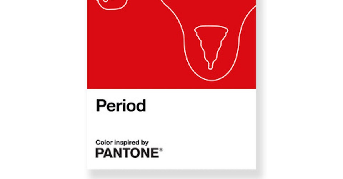
Pantone, the color matching company, has created a red shade called “Period” to promote the normalization of menstruation, and we are here for it!
RELATED STORIES


It’s time to change the conversation.

This vivid shade of red is described as “an active and adventurous red hue,” Laura Pressman, vice-president of Pantone, said . “Period emboldens people who menstruate to feel proud of who they are.”
No one’s body should be punished for being itself.

Pantone has teamed up with the Swedish period franchise, Intimina.
Together, they’ve formed a campaign, “Seen + Heard,” which is dedicated to providing a healthy dialogue for all genders and identities to honor authentic talks about menstruation.
Body positivity should be for everyone, period.

Pantone asserts that while millions of people have periods, the natural process is still taboo.
People with all different kinds of bodies have periods, and they’re all beautiful.
Pantone’s bold stance is one to follow.
“Period” is a beautiful, bold, and vulnerable shade of red that no one can deny as soon as they see it.
It’s time to paint over discrimination and take Pantone’s lead when it comes to challenging the way to address menstruation and the bullying of bodies.
Here’s to more companies taking a bold stand.

