


I took a few design courses in college but I realized that I was more suited toward fine art and writing. I don’t have the patience for creating truly great design.
But it allowed me to appreciate the work involved in getting a design just right, and every one of the choices below are just wrong.
RELATED STORIES


This bike lane seems like a bad idea.

Look, you need to choose between preserving the trees or having a bike lane. This compromise just isn’t going to work and either people are going to hurt themselves or just never use it.
This is very inspiring for new graduates…

Nothing says onto the next stage in life like an oncoming train! Judging by the bad photoshopping and choice of font, I think the school really cheaped out on the poster and definitely didn’t get a second opinion.
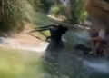
This wasn’t so bad until they cut out the handholds.

It must be a really good garbage can if it’s causing that much excitement. The fact that those are clearly a woman’s feet just makes it funnier.
Pie charts are supposed to be easy.

There’s no x- or y-axis to worry about and you have an entire tasty metaphor to guide you.
I really, really, really need to know what sorts of things fall under “other.”
I’ll give them this: They are successfully keeping people out.

Of course, since even the person who should be able to get in can’t even create their passcode, it’s probably a bit too secure.
This is almost funny and cute enough that I would buy it.

It’s a handy little table that would be nice on the porch, but if you’re going to charge me $80 for a cute, little table, it should know the difference between milk and a cow.
Were the lines meant to go under the words? Like, underlining them?

That’s the only explanation I can think of besides a total misunderstanding of what a strikethrough means.
Commas save lives, but I think this sign needs more than that.

At the very least, “pedestrians” should be enlarged to match “hunters” and there should be a period after hunting to make it clear that they are separate instructions.
This is the logo design on a church softball league’s t-shirts.

While I agree with the logic that simply having the initials for Christian Life International would be a bit boring, the choice of cross placement is…problematic.
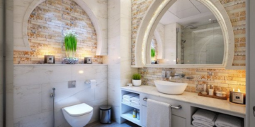
A little privacy, please?

It wouldn’t be a roundup of epic design fails without at least one bathroom mishap.
Bathroom doors shouldn’t have windows. Duh.
To be fair, you’d be wide awake after a single sip from this mug.

You’d have lost an eye, but you would definitely be awake. Besides being weaponized, those ears also mean that the mug isn’t friendly for lefties.
There is so much wrong with this…

From what I can tell, the bench is actually blocking the entrance, so it must not be used anymore. Which is good, because NO bear should be making that face as people enter through there.
One stubbed toe coming up!

This is probably covering a vent or something that couldn’t be moved, but usually those are done in such a way that you’re not risking your toenails every time you want to sit by the window.
Look, we know these marketing pics are fake, but at least try to do a good job.

The first rule of using a headset to turn your phone into a VR machine is to point the screen at your eyes.
The person who shared this pic actually watched a guy go into the wrong bathroom.

Hopefully, the staff was informed and they at least covered up the smaller sign until someone could come and fix the mistake.
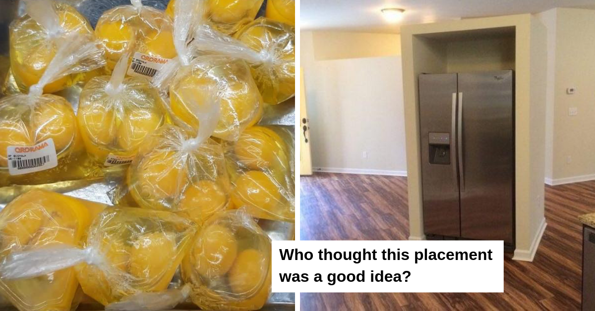
I don’t understand the logic behind packaging eggs like this.

It’s not hard to crack an egg and the shell is a natural way to keep it from being contaminated. The shells are also biodegradable and cardboard cartons are recyclable, unlike these plastic baggies.
Aw, what a cute dogg-oh…

Somewhere an unpaid intern at a design firm can’t stop laughing over the fact they managed to slip this passed quality assurance.
This bathroom is a death trap.

One slip on a wet tile and there are so many edges for your skull to hit. Also, I hope they don’t have any friends or family with mobility issues.
This is a whole lot of extra work for the worst possible fridge solution.

Who thought this placement was a good idea, anyway? The alcove-thing doesn’t even fit the fridge! There’s all that extra space up top.
We’ve all stretched to reach the TP at some point in our lives… Maybe it was in the cabinet, maybe it rolled away.

But this is just setting up the throne master for disappointment!
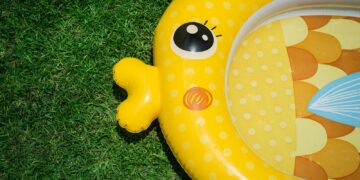
Okay, this is *straight up* weird AF — pun intended.

Ain’t nobody wanna climb into the bottom of a giant duck-lookin’, Homer Simpson-lookin’, minion-lookin’ structure.
At first glance, this actually looks like the dumbest thing ever.

But look at the top of the brick road — it was working at some point… Just had a super weak finish.
Oh, you want me to remove this screw from the packaging of this screwdriver?

Would you also like me to cut the packaging of scissors? SMH.
