


Have you ever come across what looks to be the aftermath of some sort of discussion or event and you can just tell that something strange happened there, even if you don’t know exactly what it was.
That’s how it feels to look at the designs featured in this list, ones so baffling and confusing that not even the world’s top design experts could break down exactly how they got here.
RELATED STORIES


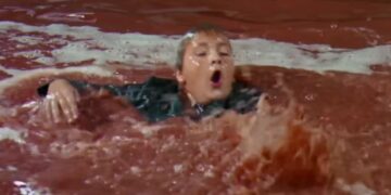
“So I almost DIED at school today (not a water bottle).”

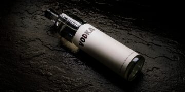
Aren’t there laws in some places that prevent chemical containers from looking like drinkware? I know we were struggling with sanitizer a few years ago when COVID was first breaking out, but surely we don’t need to rely on this anymore, right?
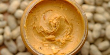
“More food, less calories… It’s win win.”

Where is this magical restaurant where you can eat more and somehow be healthier? Everyone should know about this! We need to learn their secrets, the engineering behind such a feat, this could change the world!
“[This] portable heater has started to melt its own handle.”

It’s only portable for a limited time, after that the handle becomes molten lava and actually melts down to secure the heater in place once it hardens. Choose where you put it wisely!
“One man’s crappy design is another man’s (hopefully) discounted pair of parking spaces.”

I’m not the claustrophobic type, but looking at this is making me feel anxious and itchy all over. This is the only person I’ll ever give a pass for parking in two spots, they can have ’em.
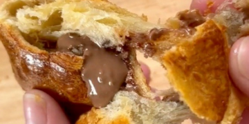
“[…] they use an environmentally friendly cup, but apparently it leaks so they just use a plastic cup beneath.”
![Image credit: reddit | [expletive]](https://static.diply.com/94ff8dd3-e6a7-44e9-b1f2-a6a3b7325a1b.jpg)
You’re helping look after the world with the first cup, then helping to destroy the world with the second cup, so you come out of this net-neutral. Not the best, but could be worse.
“The colors. The legibility. T-he Natural Eyes!”

What’s happening here? Like, at all? The first bit is supposed to be, “I’m Ready For My HARVEST,” but what is their harvest? What is the rest of it? What are natural eyes? Do I have unnatural eyes?
“A tub that’s way too small for the giant woman.”

Clearly that’s a shower, as stated by the text, and text on advertisements never, ever lie.
Really though, whatever contortionist pose she would have to pull off to keep her legs full submerged here is really impressive.
“I love stairs like this.”

Do you? Are you sure? Because I don’t. I quake in fear at any slightly abnormal staircase lest I take a stumble and break all my little fragile bones in the process.
“The idea is there… just awful execution (before/after written on her forehead).”

Am I supposed to be able to see a difference? The poor alignment aside, I really can’t tell what the product is or how one is supposed to look worse than the other. This feels like a lot of work for an ineffective ad.
“[Cell] phone cover: don’t do plan!”

Don’t just dream, do plan? Don’t do plan? The message is a little confusing, but the colors are nice.
Wait, is that pink in the background all text too? This phone case sure has a lot to say.
“[This] sofa is absolutely awful for your back.”

While that is true, it’s also created a little hole you can slide yourself into for an extremely comfortable nap. Just make sure no one sits down on the couch part otherwise you won’t be able to get out.
“Potsdam, Germany train station platforms go in order 4, 2, 1, 3, 6.”

As if navigating a public transportation method as busy as trains needed to be any harder or more confusing. I’m getting stressed out just looking at this, and I drive!
“This wheelchair ramp in a local pharmacy.”

All that effort into the little hand-painted wheelchair sign just for it to not matter the slightest bit. You helped them get up the first step, but after that, it’s up to them if they want their medicine or not.
“It’s a bit awkward making a right here.”

Whoever planned this street said you’re going to stop at this intersection whether you want to or not. You will obey the law or you will perish by my hand.
“Found this gem in my mates new rental.”

Sure, an unusable cabinet is annoying, but look at that wallpaper! It looks like it hasn’t been changed since the ’70s, and it’s absolutely fabulous. The vibes alone make up for one lost place to put dishes.
“Always wanted a NTR LOM AUA HE myself.”

Really? I’ve always been partial to NATRUAL OHMEs myself, but I guess everyone has different tastes.
I also appreciate how this billboard is the same shade as the sky, so it looks like the clouds are trying to advertise home ownership to you.
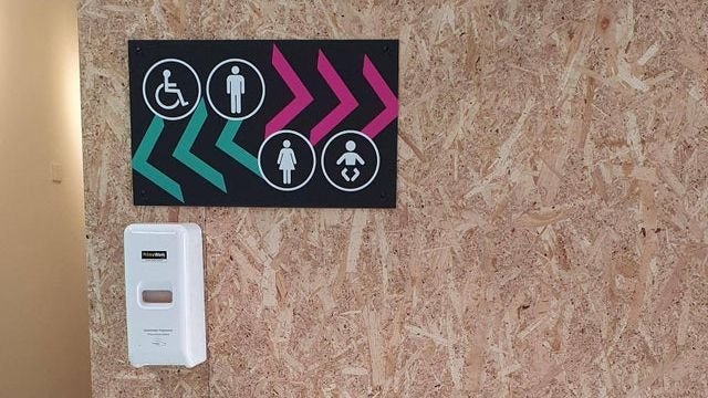
“Learnt the hard way that the men’s toilets were to the left.”

And who could blame you for thinking so after looking at this sign? I know minimalism is kind of ‘in’ right now, but this is a case where two signs would have been better than one.
“Think I’ll Pass On This Graphic Design Course.”

I almost didn’t believe this was a graphic design course but nope, there it is at the bottom, cut right off in a perfect final act of irony. I do kind of want to take this course, just to see what it’d entail.
“Took me a while to realize it wasn’t ‘odado’.”

There’s someone out there named Odado who was so excited when he saw this sign not only calling him a super dad, but inviting him to have donuts too. Don’t worry Odado, we’ll get you your donuts one day.
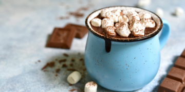
“I like my coffee with milk…oh wait. It’s a wash machine softener.”

Forget it looking like milk, that looks like a juice carton. Sure, there’s a picture on the lid saying don’t drink, but do they think kids stop to look at those? Absolutely not. Just don’t put chemicals in a drink carton to start! We’ve gone full circle!