


Some designs are so good, the only thing you can think of is how people came up with them. But on the flip side, that can be all you’re thinking of when it comes to bad designs, too.
I don’t know about you, but these crappy designs are making me question, well, pretty much everything at this point.
RELATED STORIES


Only you live once.

We all know what this was supposed to say. And yet, they somehow still managed to mess it up. And it’s not like you can just switch the top two boxes around; there’s a size order.
“What a deal!”

It looks like there was another price underneath that price sticker that they wanted to cover up. But, like, they couldn’t have blacked out that old price with marker or something?
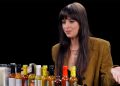
“So how much wine? A cup would be understanding. But what if it’s less than a cup and what about temp???”

There’s this really neat function in word processing programs like Microsoft Office and stuff. It lets you adjust margins. I dunno if the person who formatted this cookbook knew about it, though.
“Free Your Wind.”

I know it’s supposed to say “free your mind.” I know that. But that butterfly looks nothing like the letter M. A W, maybe. But an M? Not a chance.
This is just a fart joke waiting to happen.
“All this packaging for just three stacks of thin chocolate?”

I feel like most food packaging could get rid of, like, one component, and it would be just fine. And less wasteful. And probably less time and effort to produce. Like, you literally can’t go wrong.
“This is how the house is drawn, the path is supposed to be this unsymmetrical, tried to convince them but no one can change this.”

I don’t like this one bit. The path just looks weird. Maybe it’ll look better once there’s grass and landscaping and stuff back there? Like, a tiny bit better?
“Yellow lemon on a yellow can…”

Yeah, they definitely didn’t think that through very much. I’m sure it would’ve been a nice design. You know, if they did something to keep the lemon from blending into the background.
“Bank updated its website, this is how all confirmations print off now.”

This is the most frustrating thing I’ve ever seen. Did this website forget that print-friendly pages exist? Because they do.
Just because most people these days don’t even own a printer doesn’t mean they have to do this.
“The cream I bought’s box has more air than a lays bag, and the cream itself wasn’t full either.”

I absolutely hate it when skincare does this. I swear, I go to buy a box from Sephora or something, and end up with this unnecessarily large box every time!
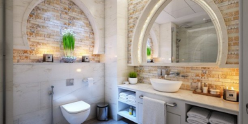
“Exterior bathroom lock, I can only imagine the bathroom was previously used to harbour a hostile animal.”

Something about this entire door situation is weirding me out. I don’t know about you, but public bathrooms that look super uninviting are just plain creepy to me. I’d rather hold it in until the next stop.
” cAfé & restAurAnt.”

I just… want to know… what the point of capitalizing all the As was. Like, other than being super annoying. Maybe it’s to stand out, so people will want to go there?
“Recycling and garbage going into the same bag.

Sadly, this is actually pretty common. A lot of places have garbage and recycling that goes to the same place. It’s honestly so rude, and makes me feel cheated.
“This soda dispenser is probably the most counter intuitive I’ve seen.”

It advertises being touchless, but I can guarantee people are going to be touching that spot regardless. Why not just use the ones where you have to push the cup?
The more you look, the worse it gets.

There are plenty of super badly photoshopped pictures in Amazon product pages, but this one is just plain funny. Why do their faces look like that? I’m literally dying over here.
“Can you feel the leov tonight?”

I don’t know how, but I read this as “ELVO.” I don’t know what an elvo is, and I don’t think I want to know. What I do know, though, is that they really messed this up.
“Netflix intentionally blurring the ‘HD’ image to make it look much worse than UHD… all to charge an extra $6/month (in addition to their recent price hikes).”

Yeah, this is pretty bad. Especially since HD doesn’t look nearly as blurry as they’re trying to make it seem. But when a business wants your money, they’ll do all sorts of things, I guess.
“This banner won’t go away until you agree to share your data.”

I hate it when apps do stuff like this. Just put a banner of ads on the bottom. That would be way easier than trying to get people to agree to tracking and sharing their data.
“Instagram limiting the number of accounts I can UNFOLLOW.”

I guess this is to keep people from spamming (maybe to stop people from following and unfollowing the same account over and over again really quickly)? But still, it really sucks and feels counterintuitive.
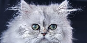
“Why did they put make up on the cat?”

I honestly have no clue what’s going on here. Just when I thought bad Amazon photoshopping couldn’t get any worse, they went and outdid themselves.
I’m so uncomfortable right now.
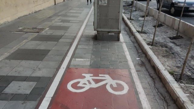
“Somehow, I don’t believe the arrow.”

Maybe when you’re planning bike lanes, you should check for any obstacles that might be there. Just a thought.